Chapter 10 Data Visualization
In this section, we will learn how to make presentation ready plots using ggplot2 and base R. We will learn how to
- make different types of plots, e.g. line plot, scatterplot, etc., using
ggplot - adjust axis labels, titles, add text, etc.
- add and adjust legends
- manipulate color, plotting characters, line types, etc.
- create lattice plots (facet) and add multiple images to the same grid
- save images
In the lesson, we will focus on using ggplot because it is more difficult to get started using, but it is equally important to be familiar with plotting in base R. I still use both frequently.
For most of our examples, we will use the child mortality rate dataset, indicatordeadkids35.csv
New names:
Rows: 197 Columns: 255
── Column specification
────────────────────────────────────────────── Delimiter: "," chr
(1): ...1 dbl (254): 1760, 1761, 1762, 1763, 1764, 1765, 1766, 1767,
1768, 1769, 1770,...
ℹ Use `spec()` to retrieve the full column specification for this
data. ℹ Specify the column types or set `show_col_types = FALSE` to
quiet this message.
• `` -> `...1`# A tibble: 6 × 255
...1 `1760` `1761` `1762` `1763` `1764` `1765` `1766` `1767` `1768` `1769`
<chr> <dbl> <dbl> <dbl> <dbl> <dbl> <dbl> <dbl> <dbl> <dbl> <dbl>
1 Afghani… NA NA NA NA NA NA NA NA NA NA
2 Albania NA NA NA NA NA NA NA NA NA NA
3 Algeria NA NA NA NA NA NA NA NA NA NA
4 Angola NA NA NA NA NA NA NA NA NA NA
5 Argenti… NA NA NA NA NA NA NA NA NA NA
6 Armenia NA NA NA NA NA NA NA NA NA NA
# ℹ 244 more variables: `1770` <dbl>, `1771` <dbl>, `1772` <dbl>, `1773` <dbl>,
# `1774` <dbl>, `1775` <dbl>, `1776` <dbl>, `1777` <dbl>, `1778` <dbl>,
# `1779` <dbl>, `1780` <dbl>, `1781` <dbl>, `1782` <dbl>, `1783` <dbl>,
# `1784` <dbl>, `1785` <dbl>, `1786` <dbl>, `1787` <dbl>, `1788` <dbl>,
# `1789` <dbl>, `1790` <dbl>, `1791` <dbl>, `1792` <dbl>, `1793` <dbl>,
# `1794` <dbl>, `1795` <dbl>, `1796` <dbl>, `1797` <dbl>, `1798` <dbl>,
# `1799` <dbl>, `1800` <dbl>, `1801` <dbl>, `1802` <dbl>, `1803` <dbl>, …We will need to prepare this dataset first by 1) giving the first column a descriptive column name, 2) transform to a long version of the dataset, 3) convert the new year column to numeric type.
mort = mort %>% dplyr::rename(country = "...1")
long = mort %>% pivot_longer(cols = -country, names_to = "year", values_to = "morts")
pivot_longer: reorganized (1760, 1761, 1762, 1763, 1764, …) into (year, morts) [was 197x255, now 50038x3]mutate: converted 'year' from character to double (0 new NA)# A tibble: 2 × 3
country year morts
<chr> <dbl> <dbl>
1 Afghanistan 1760 NA
2 Afghanistan 1761 NA10.1 Plotting with ggplot2
In Chapter 6, we saw how to make plots using the qplot (quick plot) function from ggplot2. Now, we will learn how to use the more general ggplot function to create layered graphics. This section will serve as an introduction to the most common ggplot2 functions, and how we use them to modify plots. There is of course much more than we can cover in a single lesson. For more details on using ggplot2 see ggplot2: Elegant Graphics for Data Analysis by Hadley Wickham.
10.1.1 The Basics: geom and aes
The general plotting functions of ggplot2 is ggplot and is very powerful using the grammar of graphics. When creating a plot, there are two essential attributes of the plot you need to specify: aesthetics and geoms
Aesthetics are mappings between the variables in the data and visual properties in the plots. Aesthetics are set in the aes() function and the most common aesthetics are
- x
- y
- color/colour
- size
- fill
- shape
- linetype
- group
If you set these in aes, then you set them to a variable. If you want to set them for all values, set them in a geom.
The other essential element of a ggplot is a geom layer to determine how the data will be plotted.
geom_point- add pointsgeom_line- add linesgeom_density- add density plotgeom_histogram- add a histogramgeom_smooth- add a smoothergeom_boxplot- add a boxplotgeom_bar- add a bar chartgeom_tile- rectangles/heatmaps
You add these layer with + sign. If you assign a plot to an object, you must call print to display it (this is the same a submitting the name of the object to the console).
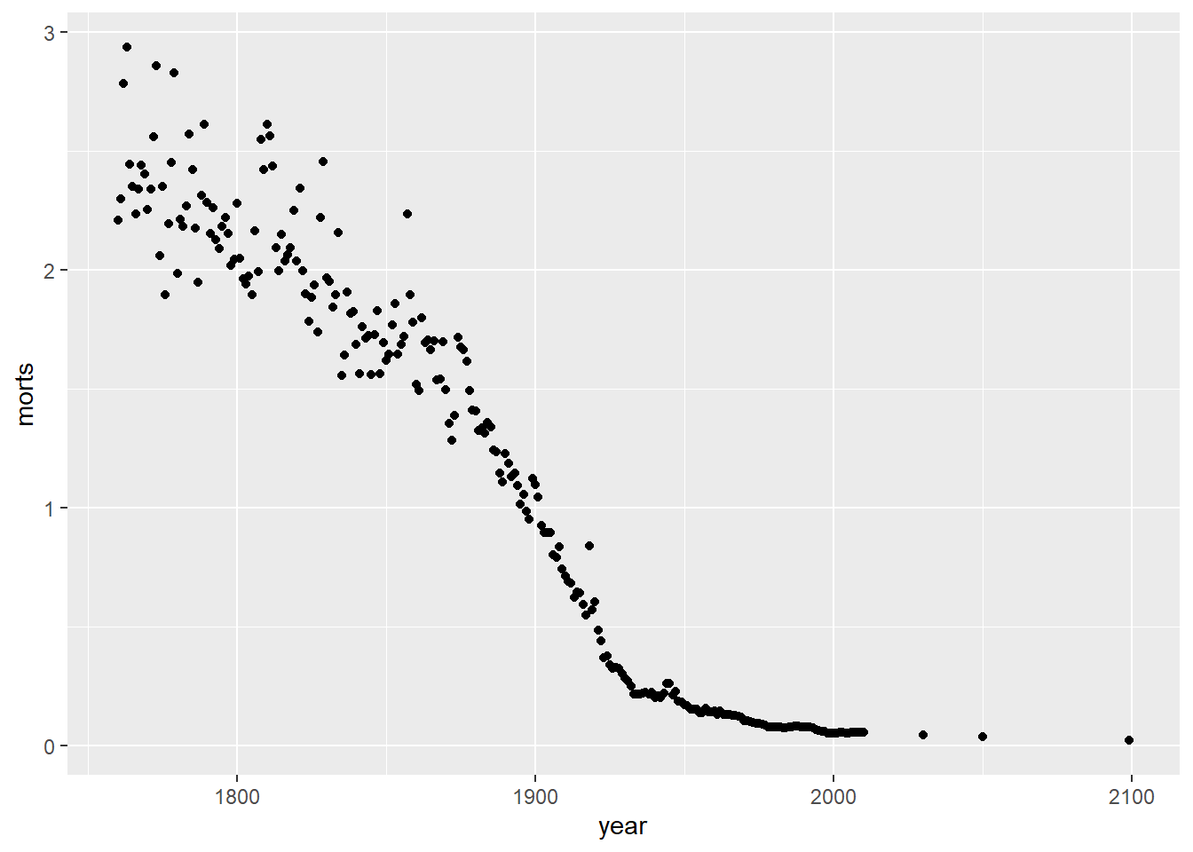
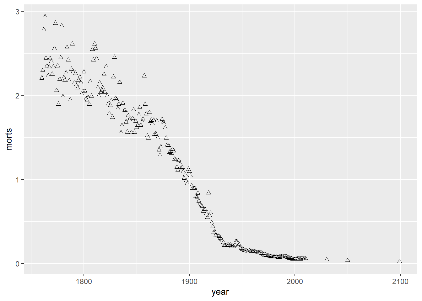
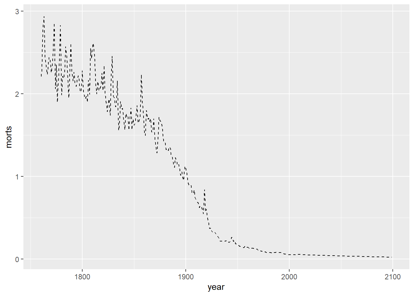
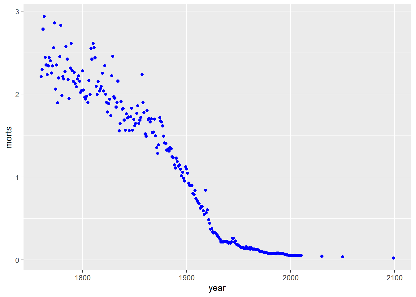
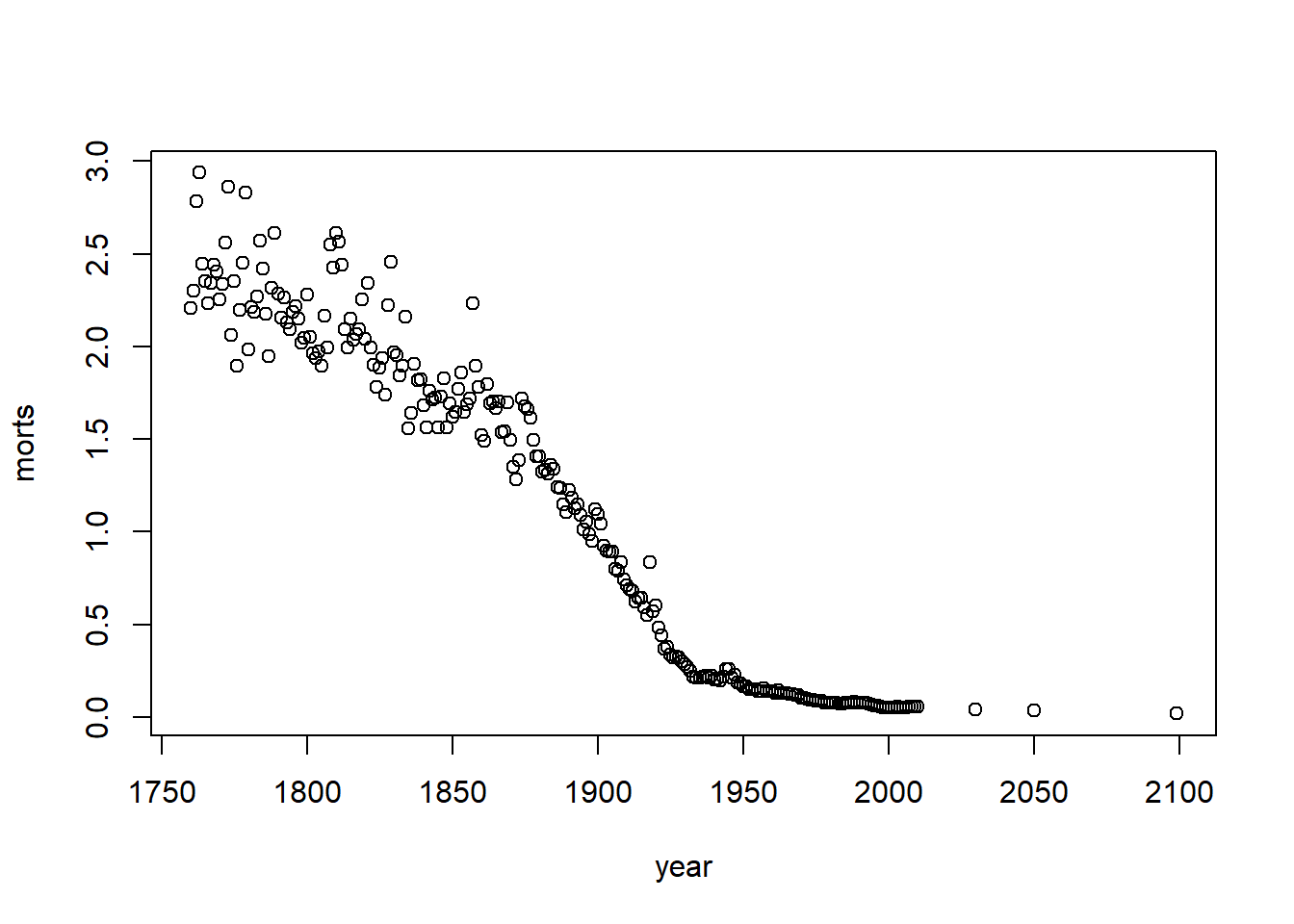
Let’s look at the mortality rate is Sweden over time in scatterplot.
filter: removed 49,784 rows (99%), 254 rows remainingg = ggplot(sweden_long, aes(x = year, y = morts))
g # nothing happens because we don't have a geom layer yet
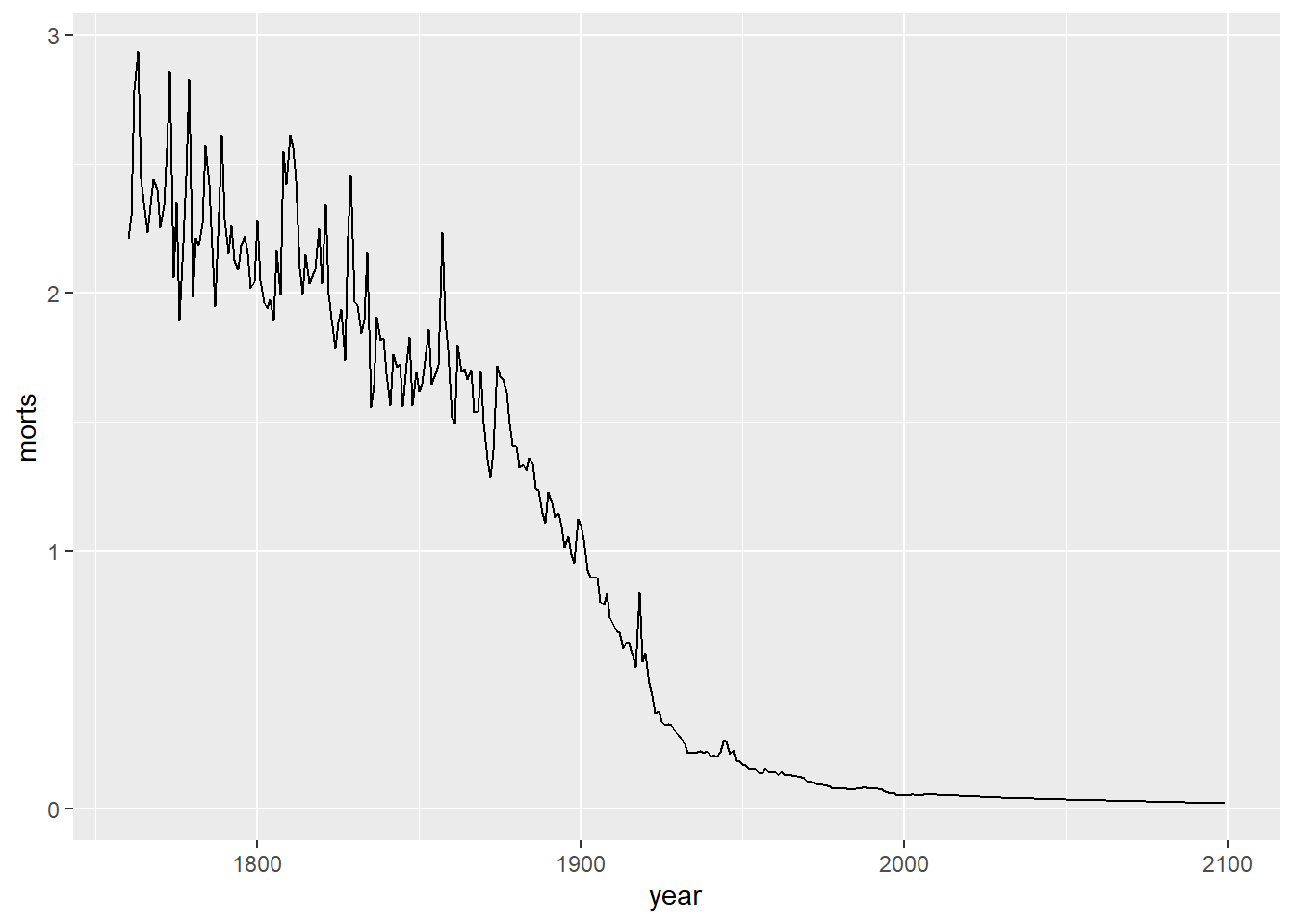
I could have also made a line plot. Note that I can use the same base object g where I defined the aesthetic mapping, but now I add a geom_line() layer instead of points.
I can also add multiple layers to the same plot. Let’s add a smoother through the points.
`geom_smooth()` using method = 'loess' and formula = 'y ~ x'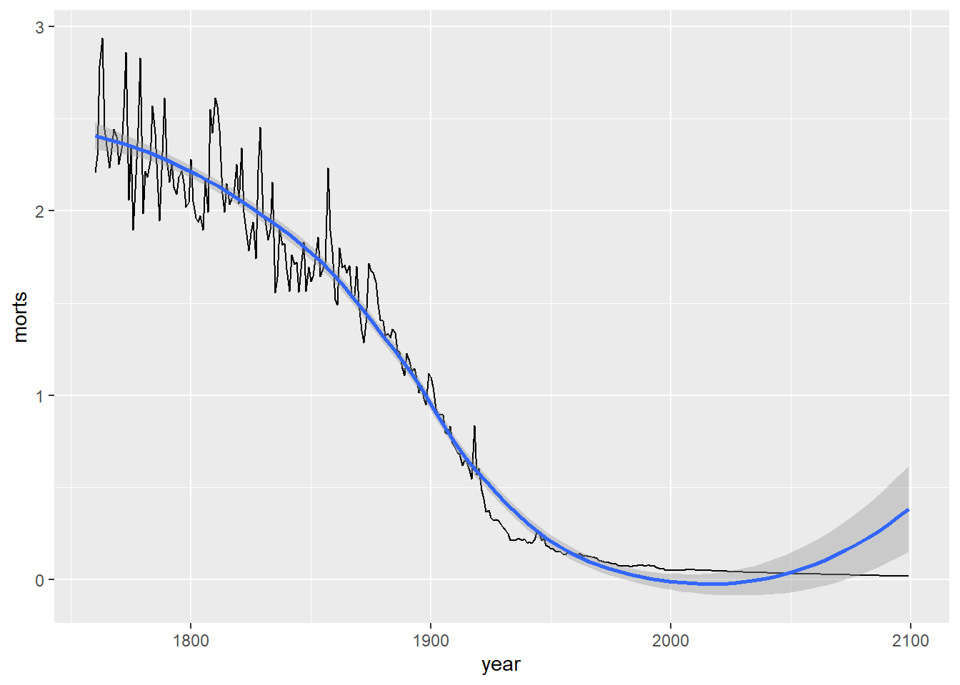
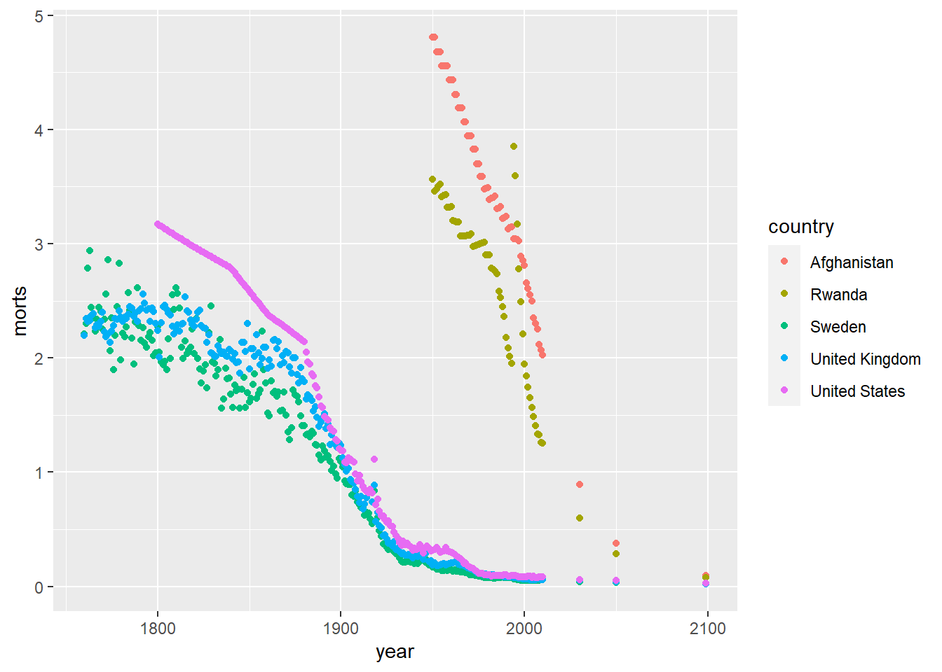
If we want to change the data we are using in the plot, we need to make a new call to ggplot. For example, now let’s look at the mortality rates over time using line plots for each of the countries: United States, United Kingdom, Sweden, Afghanistan, Rwanda. To get a line for each country individually, we need to specify the group aesthetic and map it to the country variable.
sub = long %>%
  filter(country %in% c("United States", "United Kingdom", "Sweden",
                       "Afghanistan", "Rwanda"))
filter: removed 48,768 rows (97%), 1,270 rows remaining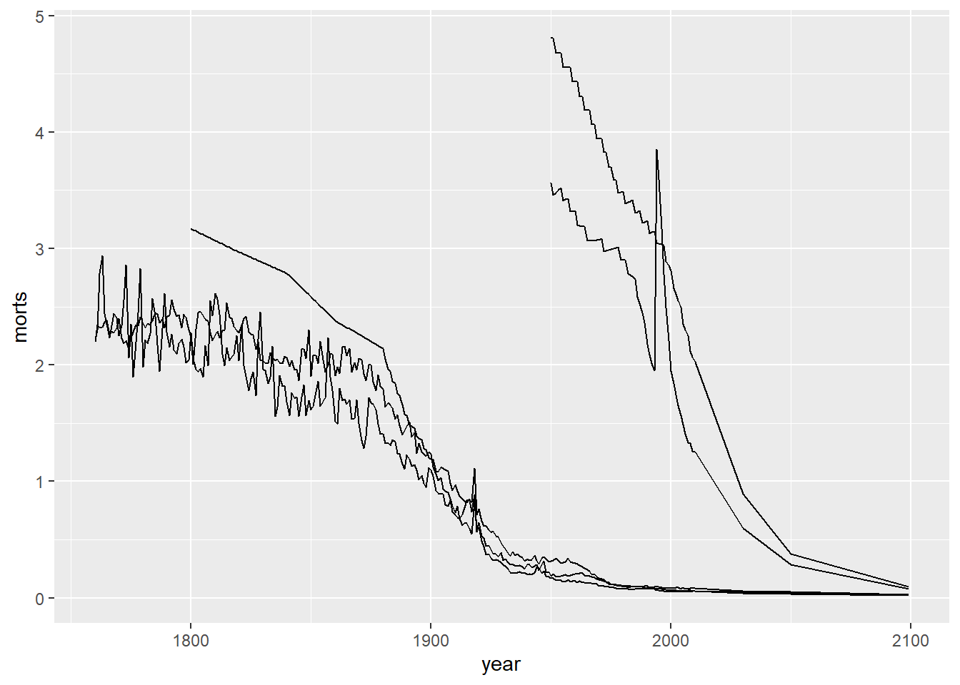
Note that we have a single plot with a trajectory over time of the mortality rates for each of these five countries, but we cannot tell which country corresponds to which line. We will see how to fix this by using color and a legend in the upcoming sections.
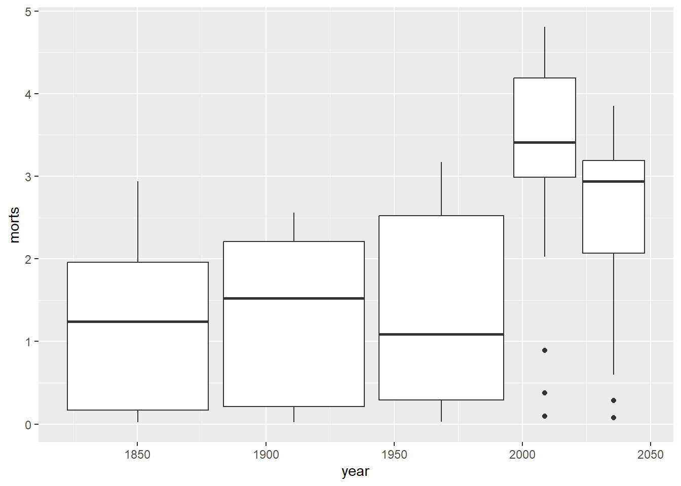
We could have also made side by side boxplots of the mortality rates by country using the group aesthetic.
10.1.2 Axes and Titles
The first adjustment we might want to make to a plot is adding descriptive axis labels and a title. We can do this using either the labs function or the individual xlab, ylab, and ggtitle functions.
gg <- g + geom_line() +
  labs(x = "Year", y = "Mortality Rate", title = "Child Mortality Rates",
      subtitle = "Stratified by Country")
gg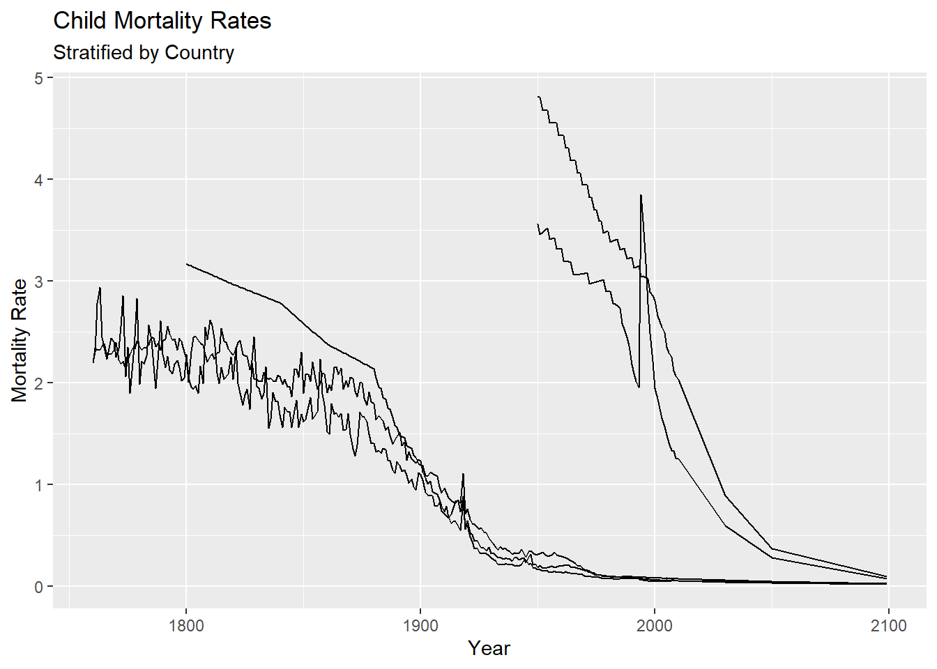
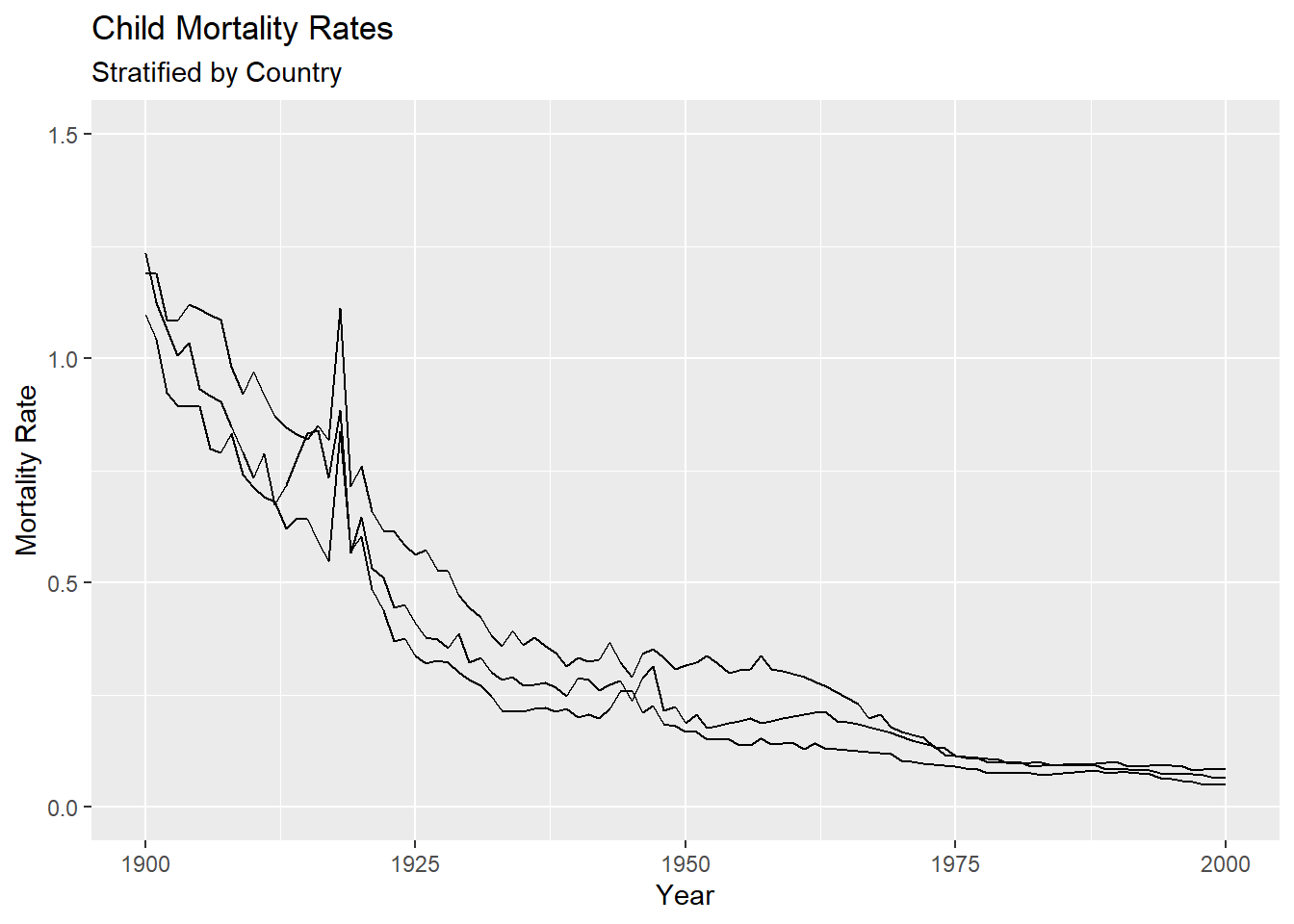
The x and y axis limits can be adjusted using the xlim() and ylim() functions to change the view of the plotting regions. For example, let’s zoom in on the years 1900-2000 for the bottom three lines. The mortality rates in this region appear to range from 0 to 1.5.
We may also want to change the default tic marks on the x and or y axes. This can be done by using the function scale_x_continuous and scale_y_continuous, since both the x and y variables are being treated as continuous in this plot. For example, let’s change the axis tics to go by 50 instead of 100 years and 0.5 instead 1 for mortality rate. We do this by setting the breaks argument in the corresponding scale_*_continuous functions.
gg + scale_x_continuous(breaks = seq(1750, 2100, by = 50)) +
  scale_y_continuous(breaks = seq(0, 5, by = 0.5))
If you want to change the text displayed at each of these tic marks to be different from the actual numbers, use the labels argument.
gg + scale_x_continuous(breaks = seq(1750, 2100, by = 50), labels = letters[1:8]) +
  scale_y_continuous(breaks = seq(0, 5, by = 0.5))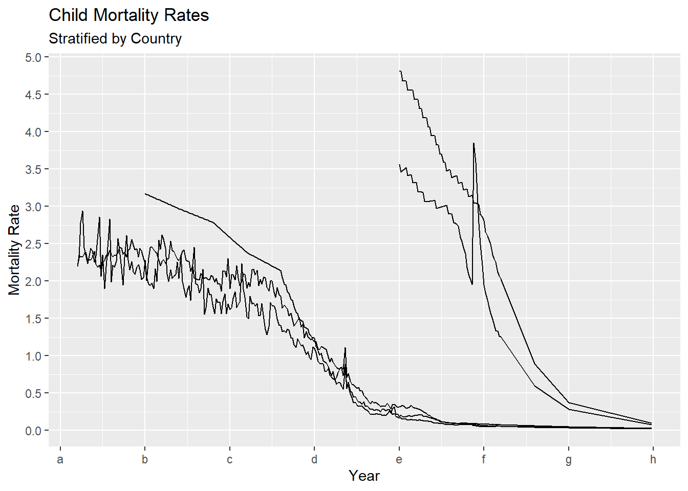
We may also want to change the position and appearance of the text appearing in the titles or axes. In order to make these changes, we need to use the theme function (see ?theme for all this function can do). theme controls most of the look and feel of the plot. The arguments passed to theme components are required to be set using special element_type() functions. There are four major types.
element_text(): used to set text element attributes such as labels and titleselement_line(): used to modify line based components such as the axis lines, major and minor grid lines, etc.element_rect(): modifies rectangle components such as plot and panel backgroundelement_blank(): turns off the displaying theme.
For now, we need the element_text() function to use with theme. Inside element_text we can set
- size - adjusts size of the text
- face - font face (“plain”, “italic”, “bold”, “bold.italic”)
- family - font family
- color - font color
- hjust/vjust - horizontal/vertical justification (a number between 0 and 1)
- lineheight - similar to size for text
- angle - text rotation angle
The following example, shows how many of these work on our line plot as an example (note this is not a pretty plot, but just to show how these work).
gg + theme(plot.title = element_text(size = 20,
                                     face = "bold",
                                     family = "American Typewriter",
                                     color = "tomato",
                                     hjust = 0.5,
                                     lineheight = 1.2),  # title
            plot.subtitle = element_text(size = 15,
                                         family = "American Typewriter",
                                         face = "bold",
                                         hjust = 0.5),  # subtitle
            axis.title.x = element_text(vjust = .5,
                                        size = 15),  # X axis title
            axis.title.y = element_text(size = 15),  # Y axis title
            axis.text.x = element_text(size = 10,
                                       angle = 30,
                                       vjust = .5),  # X axis text
            axis.text.y = element_text(size = 10))  # Y axis text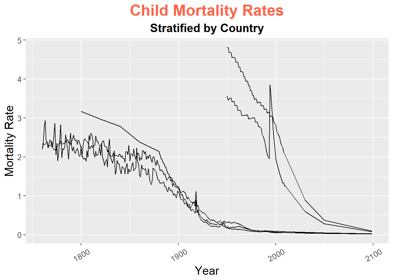
10.1.3 Plotting Characters, Line Types and Colors
To set the plotting character for a point, we use the shape aesthetic in geom_point. R has 26 plotting characters numbered from 0 to 25.
If we are using different plotting characters to distinguish between groups, we use shape inside of aes in geom_point assigned to the variable defining the groups. For example. Let’s use a different plotting character for each of the five countries in the child mortality dataset.
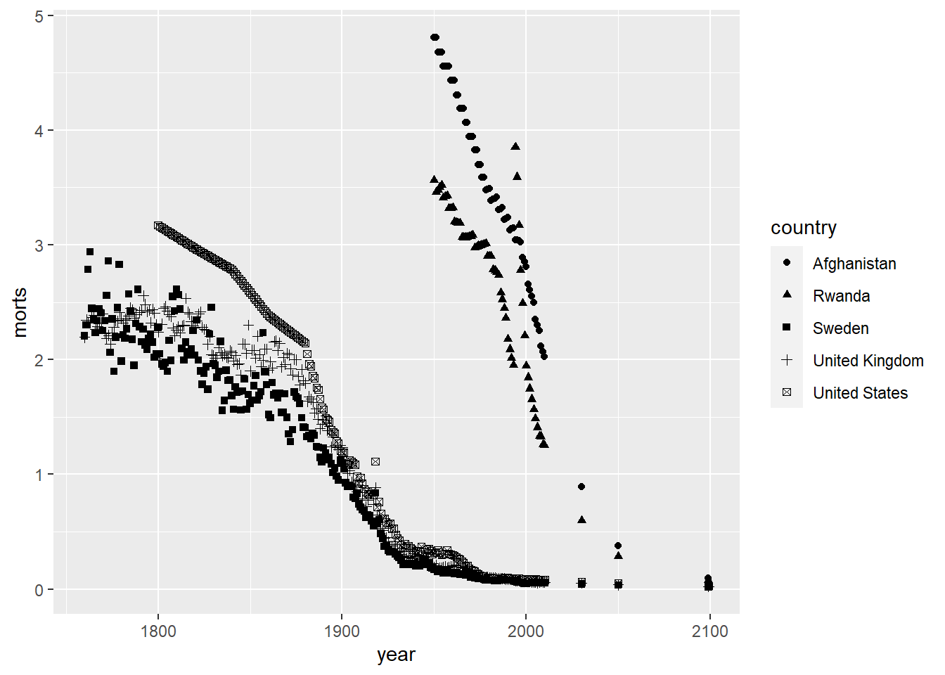
Notice that ggplot automatically chooses a set of plotting characters and makes a legend for you. We can also choose specific plotting characters for each group instead of letting ggplot choose them automatically by using scale_shape_manual.
ggplot(sub, aes(x = year, y = morts)) +
geom_point(aes(shape = country)) +
scale_shape_manual(values = c("United States" = 1, "United Kingdom" = 2,
"Sweden" = 3, "Afghanistan" = 4, "Rwanda" = 5))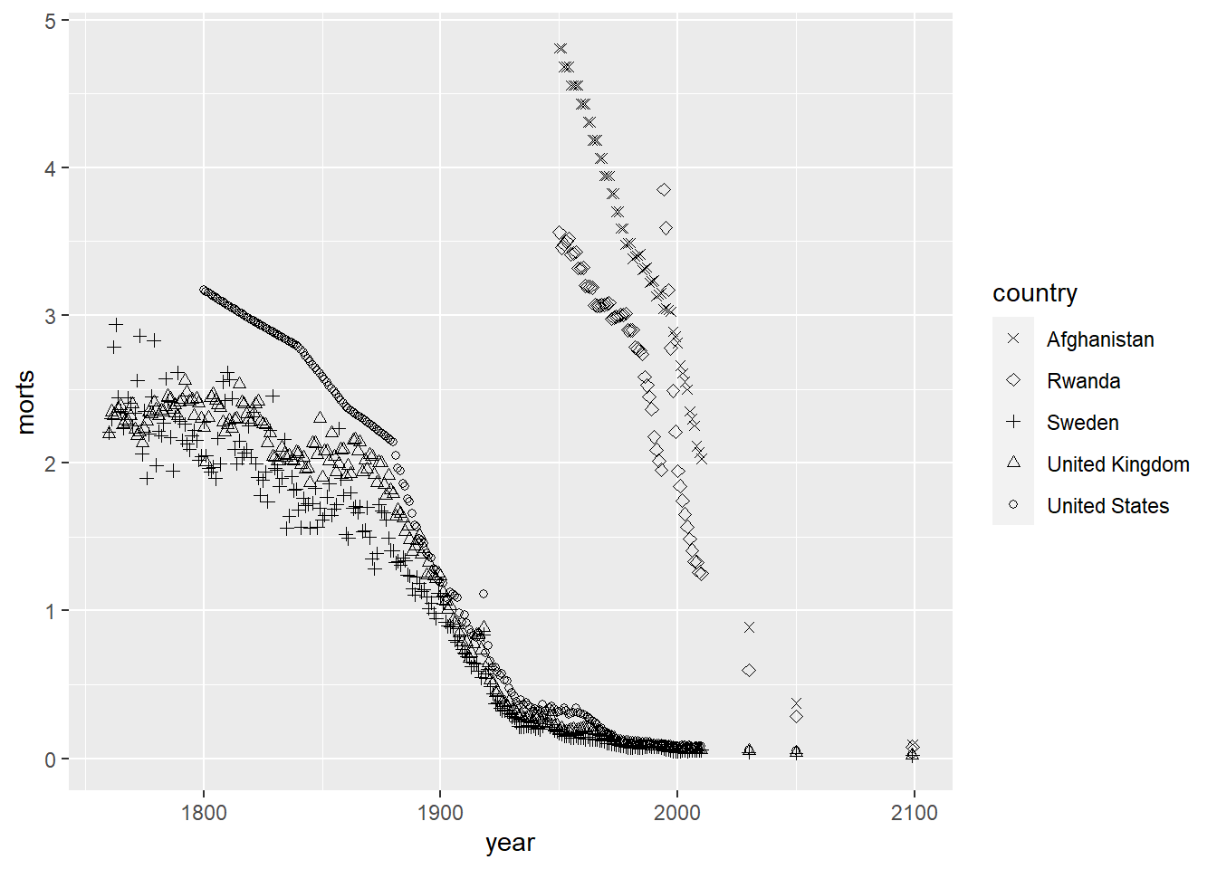
R also has 7 different line types that can be chosen by the numbers 0 to 6 or by name (e.g. “blank”, “solid”, “dashed”, etc.). We set this by using the linetype aesthetic.
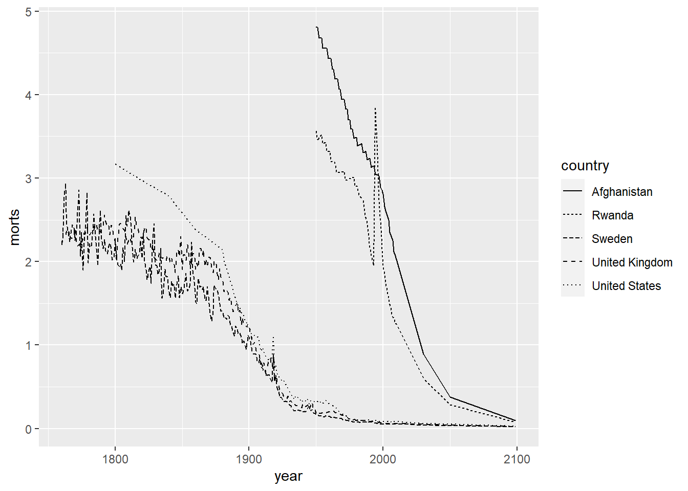
ggplot(sub, aes(x = year, y = morts)) +
geom_line(aes(linetype = country)) +
scale_linetype_manual(values = c("United States" = 1, "United Kingdom" = 2,
"Sweden" = 3, "Afghanistan" = 4, "Rwanda" = 5))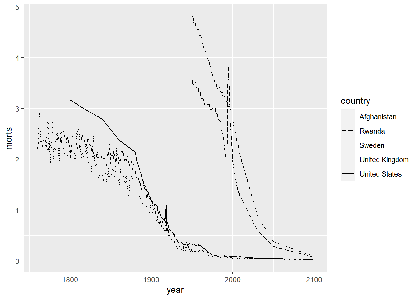
We can also modify the colors used in the plots by using the color aesthetic or the fill aesthetic depending on the plot type. Similar to plotting characters and linetypes, we can let ggplot choose this automatically by using a data mapping in the aes function or by setting them manually by using scale_color_manual. Colors can be specified by name (for some colors, see colors()), by hexadecimal codes, rgb (rgb()) values, or integer numbers.
ggplot(sub, aes(x = year, y = morts)) +
geom_point(aes(color = country)) +
scale_color_manual(values = c("United States" = "red", "United Kingdom" = "#D95F02",
"Sweden" = rgb(0,1,0), "Afghanistan" = rgb(0,0,1),
"Rwanda" = 5))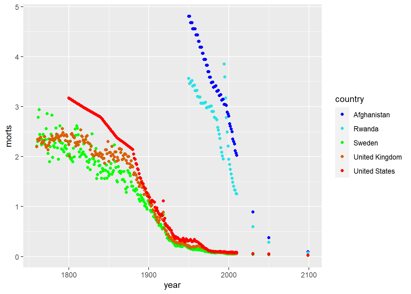
It’s actually pretty hard to make a good color palette. Luckily, smart and artistic people have spent a lot more time thinking about this. The result is the RColorBrewer package
RColorBrewer::display.brewer.all() will show you all of the palettes available. You can even print it out and keep it next to your monitor for reference.
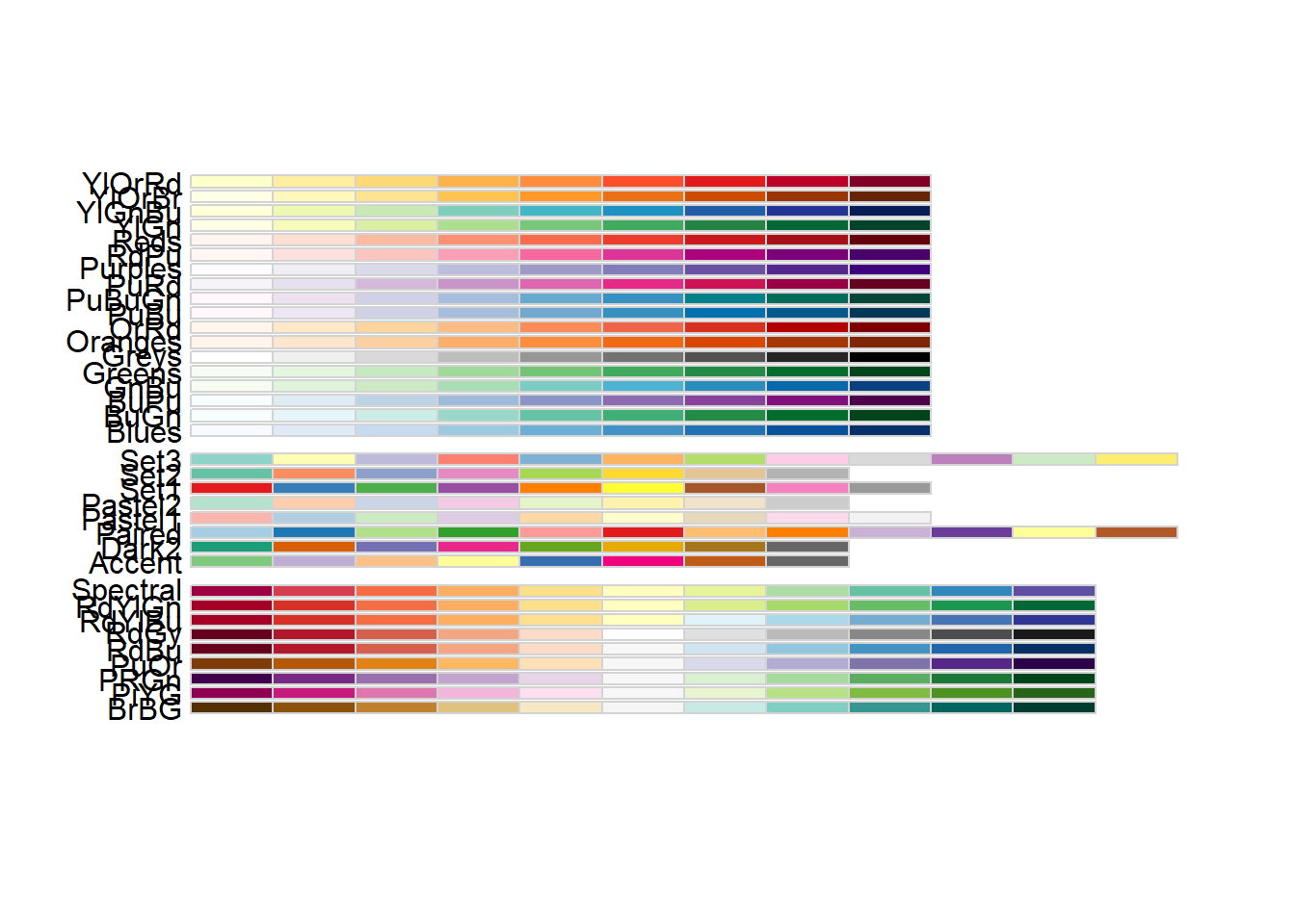
The help file for brewer.pal() gives you an idea how to use the package.
You can also get a “sneak peek” of these palettes at: http://colorbrewer2.org/ . You would provide the number of levels or classes of your data, and then the type of data: sequential, diverging, or qualitative. The names of the RColorBrewer palettes are the string after ‘pick a color scheme:’
We can use these predefined color palettes by adding the scale_color_brewer layer.
library(RColorBrewer)
ggplot(sub, aes(x = year, y = morts)) +
  geom_point(aes(color = country)) +
  scale_color_brewer(type = "seq", palette = "RdBu")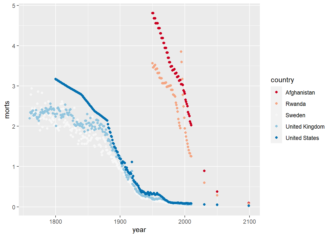
For both points and lines, we can adjust the size/thickness by using the size aesthetic.
We can of course mix all these together by adding the layers to a single plot. For example, let’s create a scatterplot with smoother lines for each group and adjust the linetypes, plotting characters and colors.
ggplot(sub, aes(x = year, y = morts)) +
  geom_point(aes(shape = country, color = country), size = 3) +
  geom_smooth(aes(linetype = country, color = country), se = FALSE, size = 1.5) +
  scale_color_brewer(type = "seq", palette = "Dark2") +
  scale_shape_manual(values = c("United States" = 1, "United Kingdom" = 2,
                                "Sweden" = 3, "Afghanistan" = 4, "Rwanda" = 5)) +
  scale_linetype_manual(values = c("United States" = 1, "United Kingdom" = 2,
                                "Sweden" = 3, "Afghanistan" = 4, "Rwanda" = 5))
`geom_smooth()` using method = 'loess' and formula = 'y ~ x'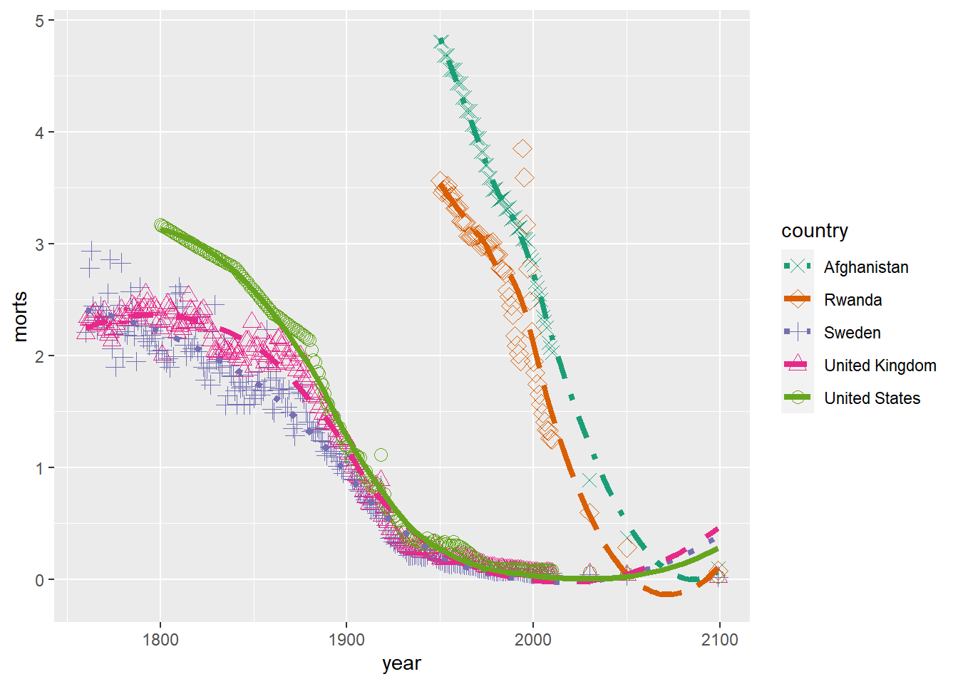
10.1.4 Modifying a Legend
To modify the labels and title text in a legend, use the correspond scale_aesthetic_vartype that was used (or could be used) to define the groups in the legend with the name argument for the legend title and labels for the group labels`.
ggplot(sub, aes(x = year, y = morts)) +
  geom_line(aes(color = country)) +
  scale_color_brewer(type = "seq", palette = "Dark2", name = "Country",
                     labels = paste("Country", 1:5))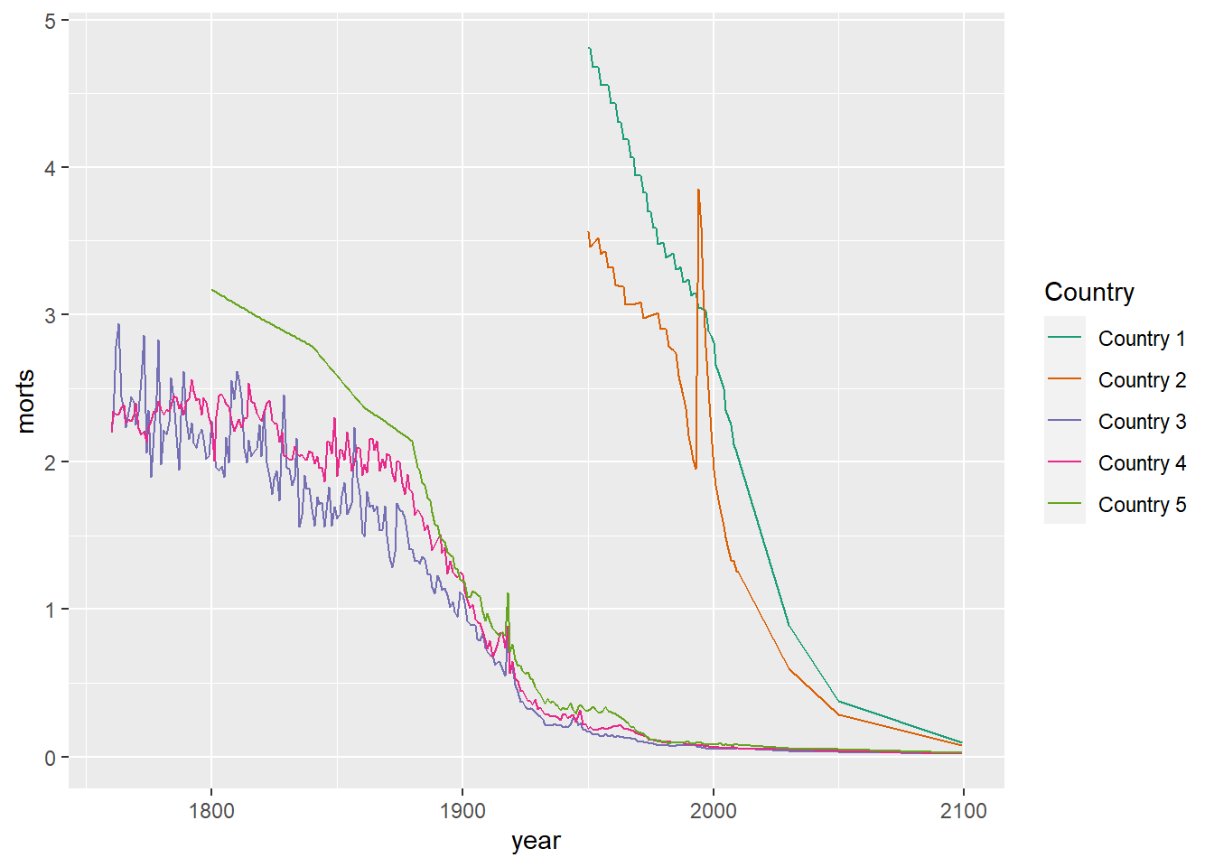
You can also disable a legend from appearing or part of the legend from appearing by using the option guide = FALSE in the corresponding scale_aesthetic_vartype function that defines the part of the legend you want to omit.
ggplot(sub, aes(x = year, y = morts)) +
  geom_line(aes(color = country)) +
  scale_color_brewer(type = "seq", palette = "Dark2", name = "Country",
                     labels = paste("Country", 1:5),
                     guide = FALSE)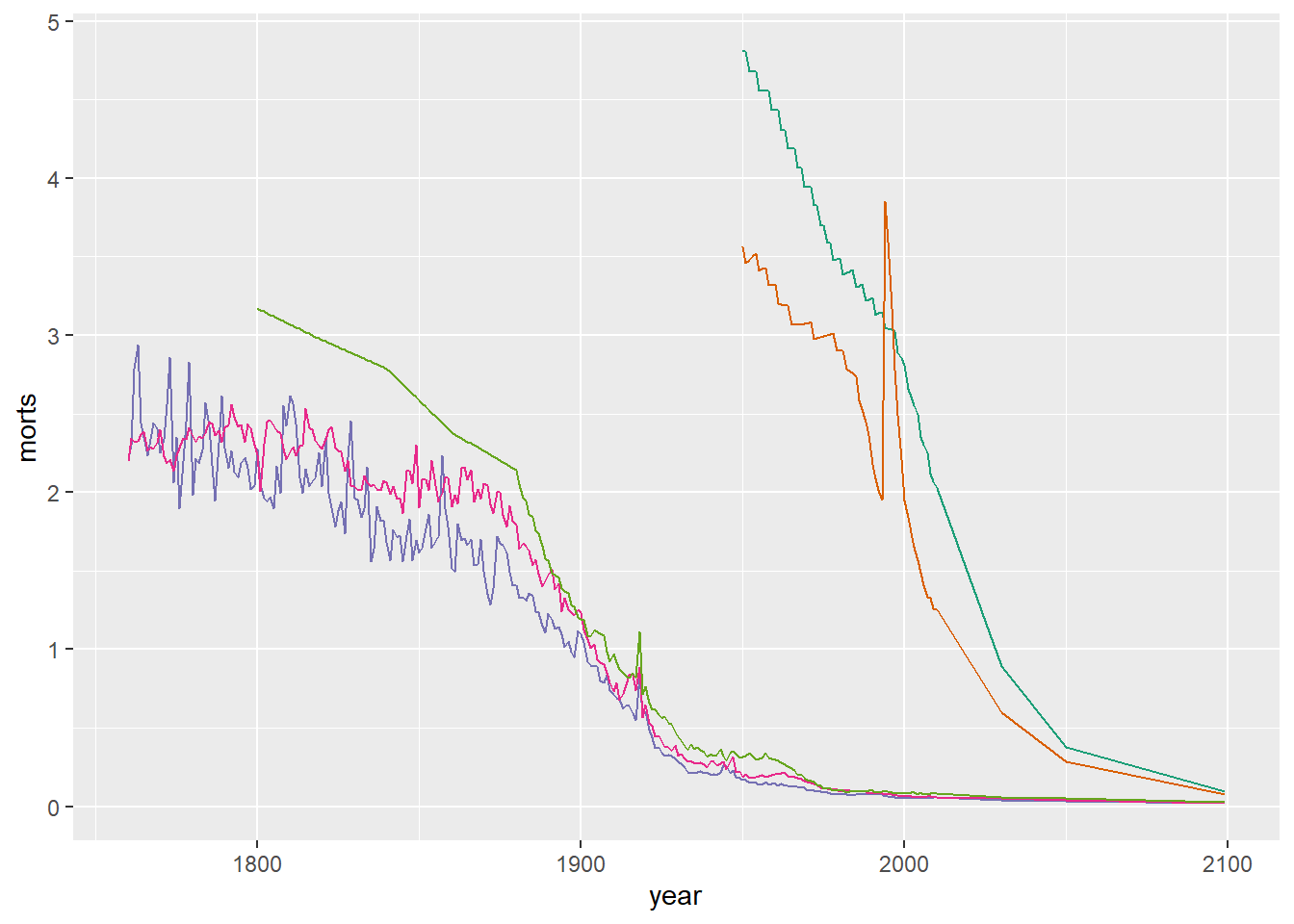
In order the style the legend text, background, or change it’s position, we need to use the various theme._ arguments in theme. Some of the different options we can set include: legend.background, legend.key, legend.text, legend.title, legend.position, legend.direction, and legend.justification. For a full list see ?theme. Remember that some of these have to be assigned using an element_type function such as element_text or element_rect.
The legend.position option allows you to specify the location of the legend as one of “none”, “left”, “right”, “bottom”, “top”, or a two element numeric vector to place it within the plot.
ggplot(sub, aes(x = year, y = morts)) +
  geom_line(aes(color = country)) +
  scale_color_brewer(type = "seq", palette = "Dark2", name = "Country") +
  theme(legend.position = "bottom")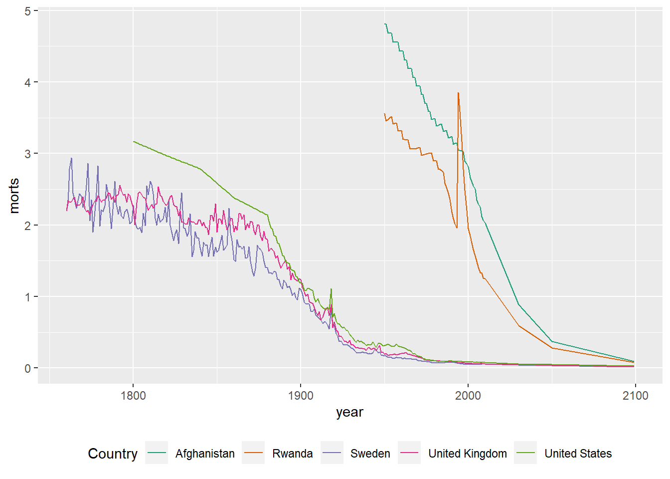
ggplot(sub, aes(x = year, y = morts)) +
  geom_line(aes(color = country)) +
  scale_color_brewer(type = "seq", palette = "Dark2", name = "Country") +
  theme(legend.position = c(0.85, 0.75))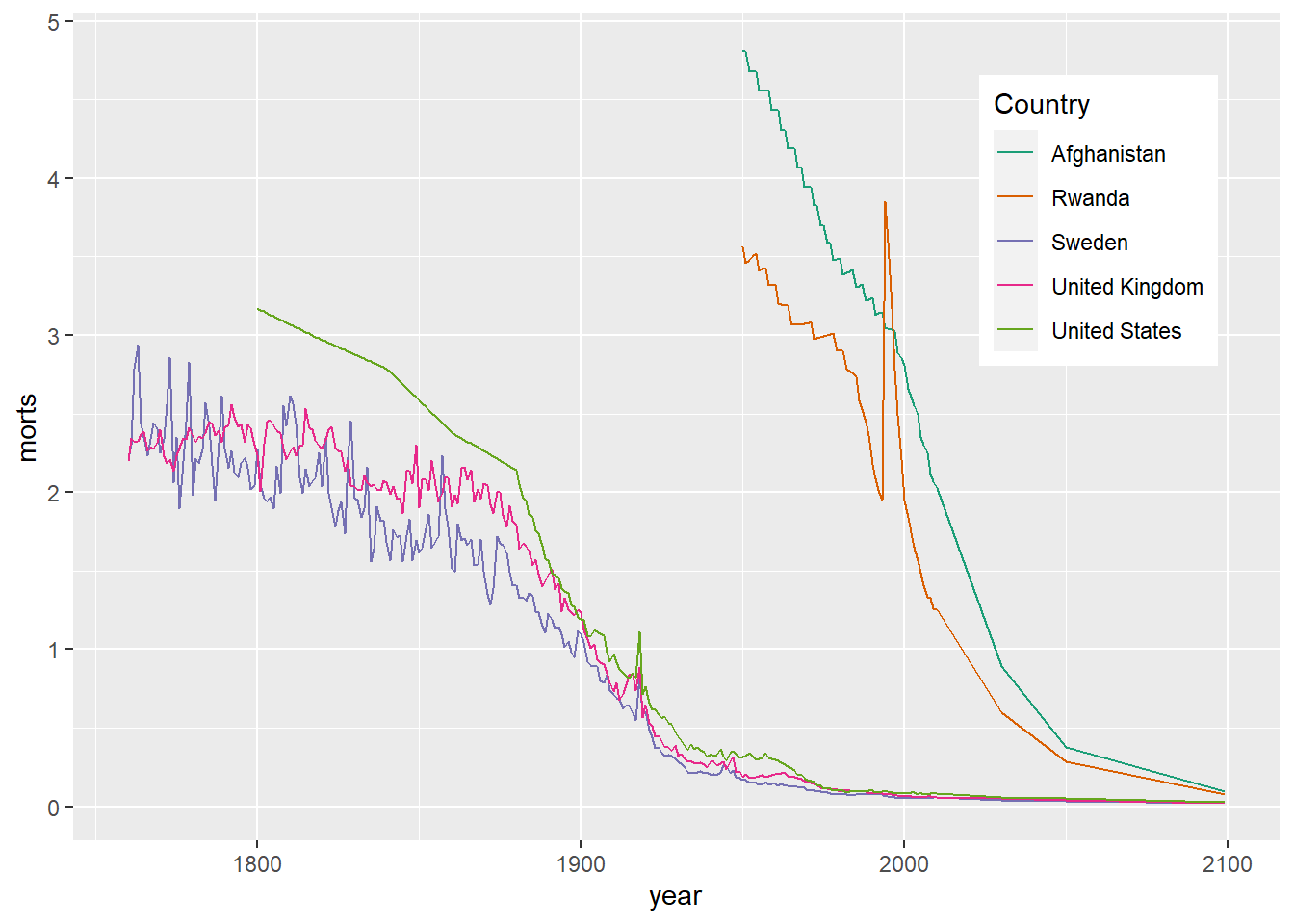
We can modify how the background of the legend appears and text size using the theme options legend.title, legend.text, and legend.background.
ggplot(sub, aes(x = year, y = morts)) +
  geom_line(aes(color = country)) +
  scale_color_brewer(type = "seq", palette = "Dark2", name = "Country") +
  theme(legend.position = c(0.85, 0.75),
        legend.background = element_rect(fill = "transparent"),
        legend.key = element_rect(fill = "transparent"),
        legend.title = element_text(size = 20, face = "bold"),
        legend.text = element_text(size = 12, face = "italic"))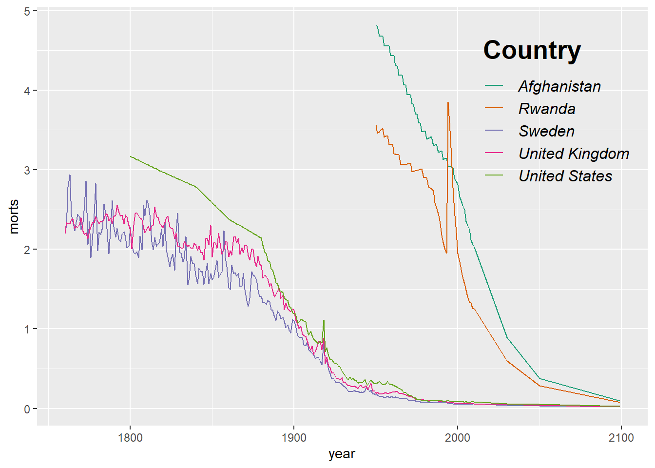
10.1.5 Adding Text, Labels, and Annotation
We can add labels to plots, e.g. to points or lines, by using the geom_text layer. For example, we can label the points in a scatterplot of the mortality rates for 1990 vs 1991. We will only use a few of the countries to make the plot legible.
mort_sub = mort[mort$`1980` > 1.5 & mort$country != "Chad",][5:15,]
ggplot(mort_sub, aes(x = `1980`, y = `2000`)) +
  geom_point() +
  geom_text(aes(label = country), nudge_y = 0.05) +
  xlim(c(1.5,3))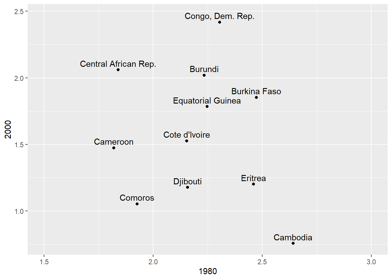
We can also add custom text to a plot by using annotate.
r = round(cor(mort$`1980`, mort$`2000`), 2)
ggplot(mort, aes(x = `1980`, y = `2000`)) +
  geom_point() +
  annotate(geom = "text", x = 1, 2.5,
           label = paste("The Pearson correlation is", r),
           size = 5, color = "blue")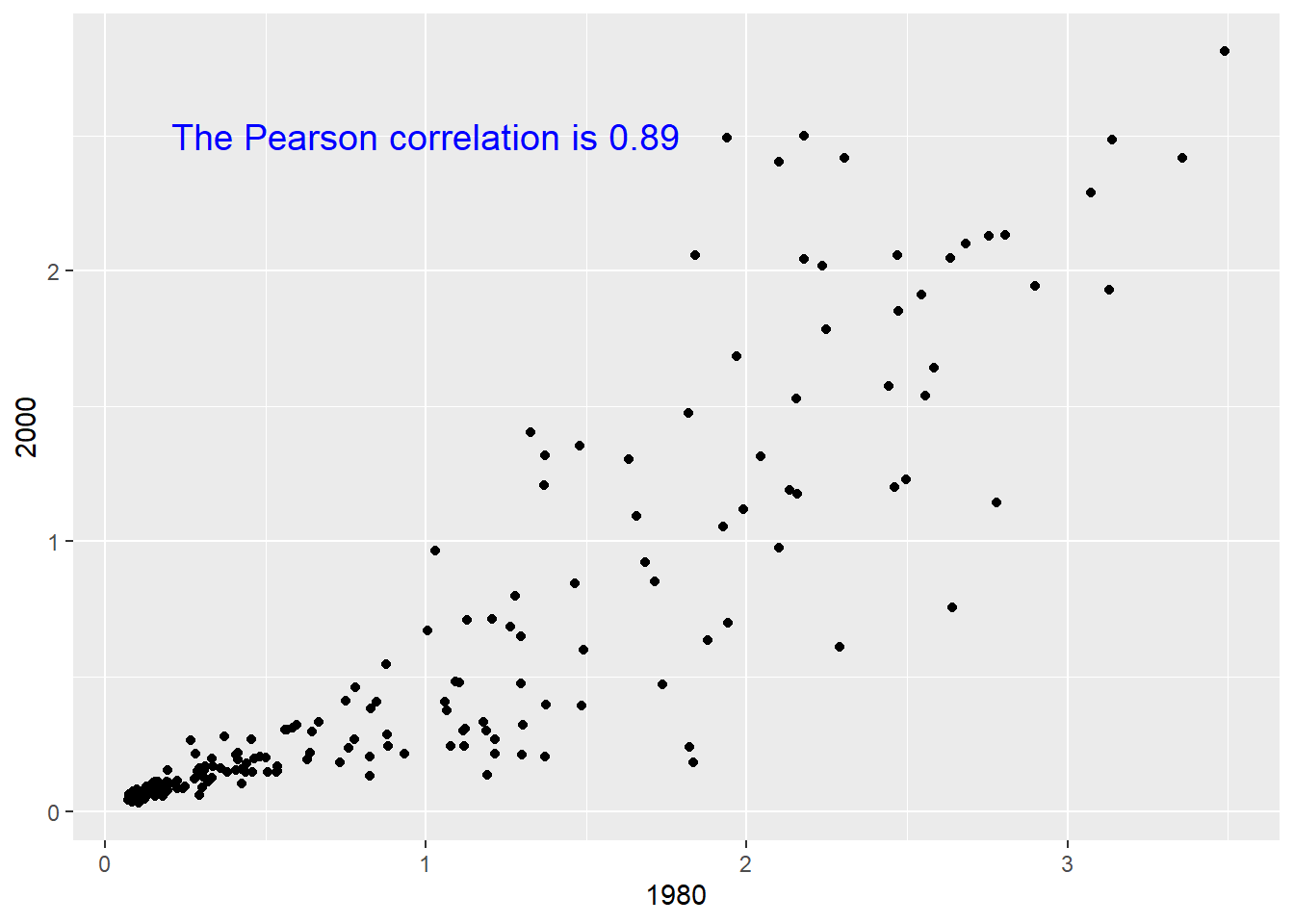
10.1.6 Drawing Mulitple Plots in a Single Figure
If we want to break down a dense plot into smaller separate plots by some grouping, we can use facet_wrap which takes a formula that defines the groups. For example, if I want 5 separate scatterplots with loess lines for the mortality data subset sub, we could usfacet_wrap to break these into 5 separate plots instead of one that are plotted in a single panel.
ggplot(sub, aes(x = year, y = morts)) +
  geom_point() +
  geom_line(aes(color = country)) +
  facet_wrap(~ country) +
  scale_color_discrete(guide = FALSE)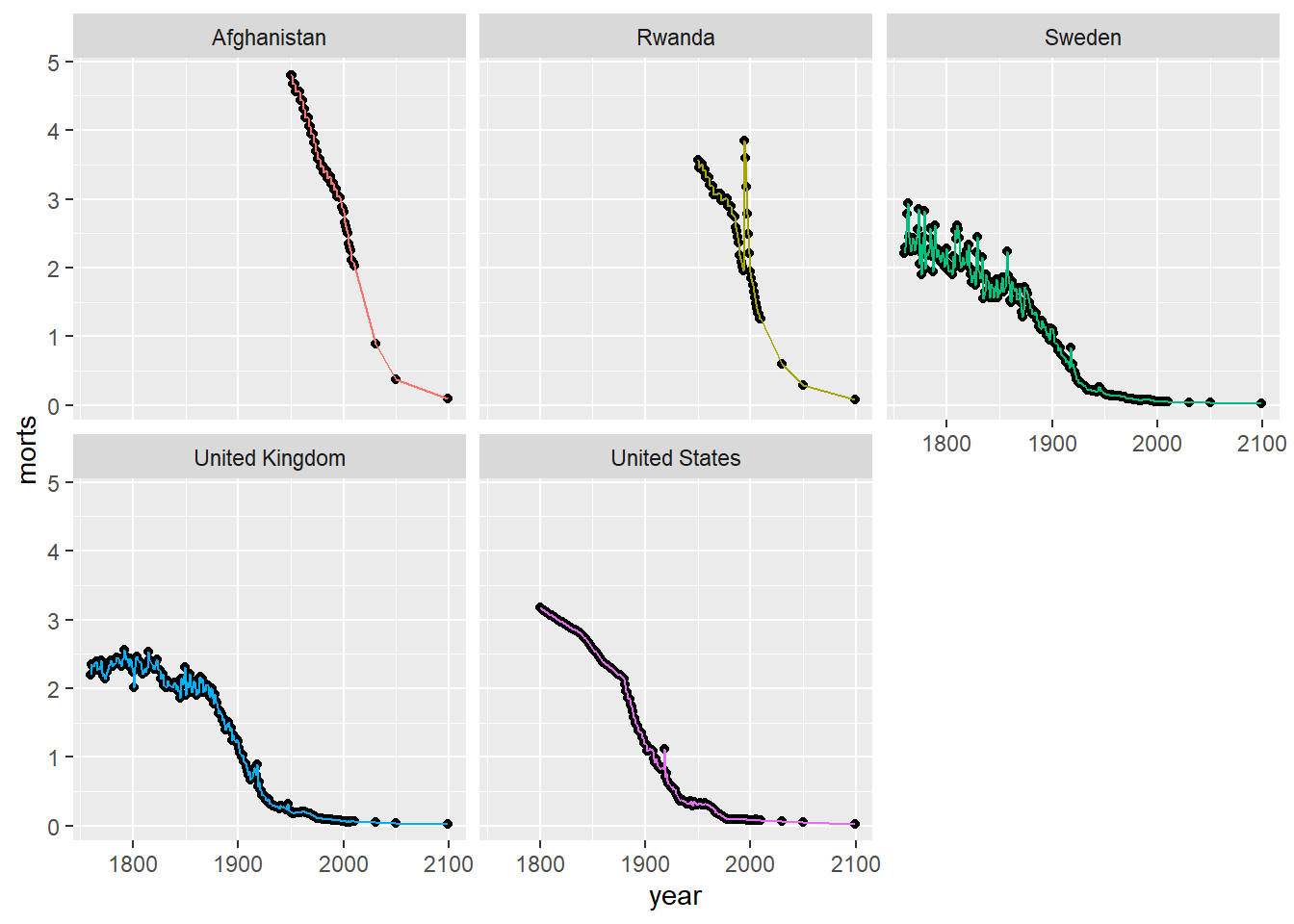
We can adjust the layout and number of rows and columns by using nrow and ncol in facet_wrap.
ggplot(sub, aes(x = year, y = morts)) +
  geom_point() +
  geom_line(aes(color = country)) +
  facet_wrap(~ country, nrow = 1) +
  scale_color_discrete(guide = FALSE)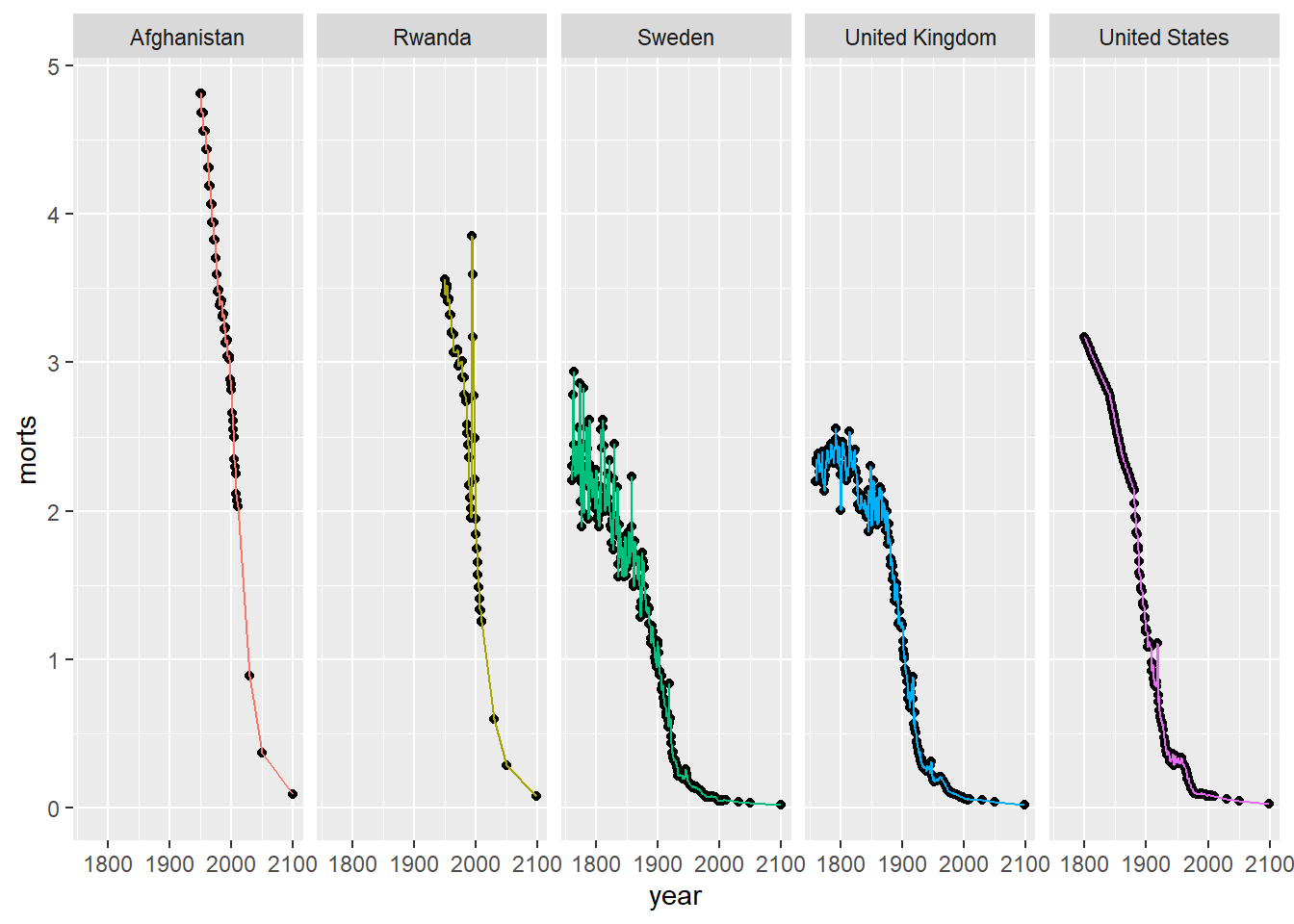
It may also be the case that we want to put several completely different plots (i.e. several different ggplot plots) in a single panel. For example, in a simple linear regression I may want to view the diagnostic plots of simple linear regression fit plot, histogram of residuals, residuals vs predicted values, and qq plot of residuals together in a panel. We will use the grid.arrange function of the gridExtra package.
First, let’s make the fit plot.
# fit plot
fitplot = ggplot(mort, aes(x = `1980`, y = `2000`)) +
  geom_point() +
  geom_smooth(method = "lm", se = FALSE)
print(fitplot)
`geom_smooth()` using formula = 'y ~ x'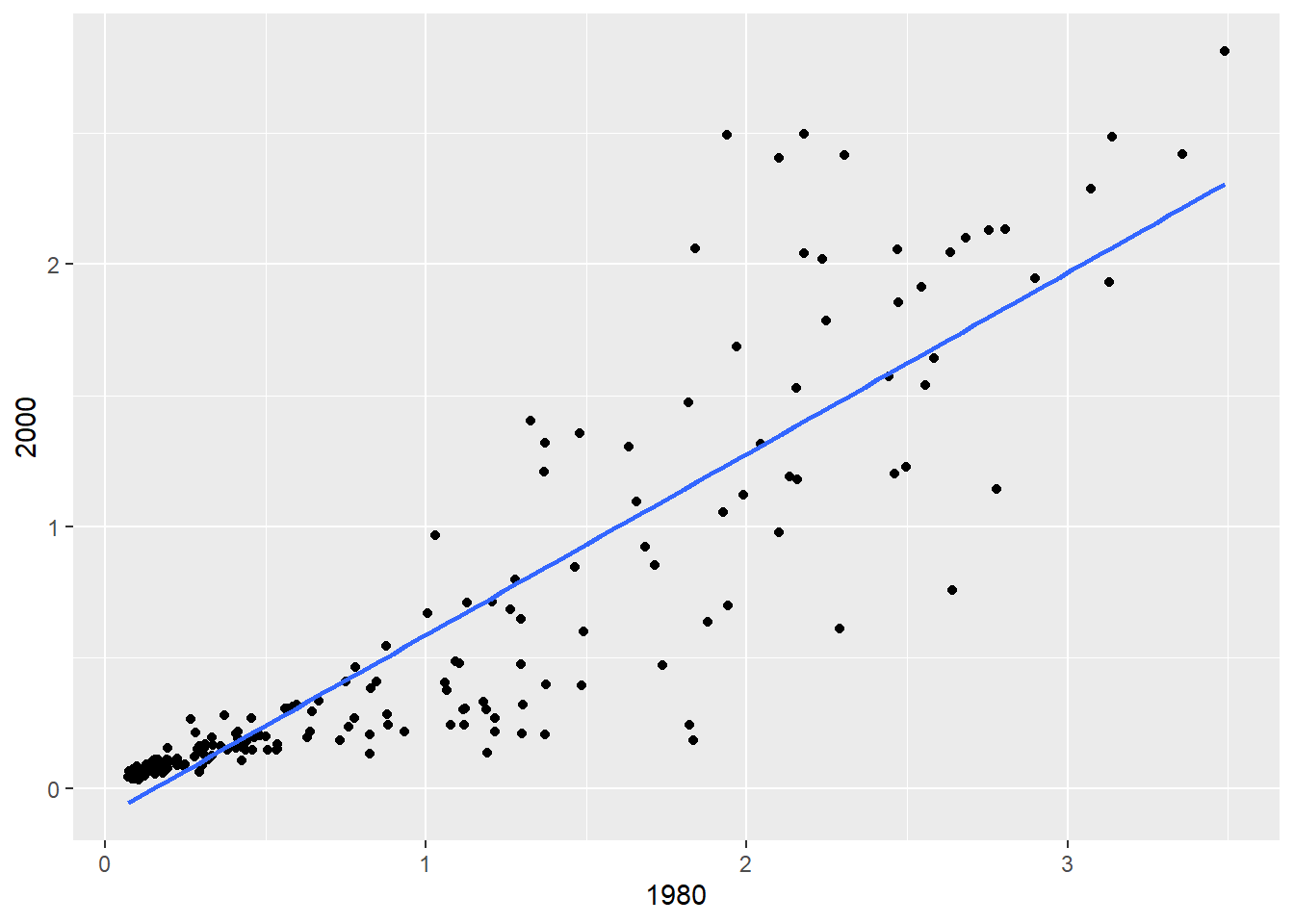
Here we fit the linear regression model and get the residuals and fitted values to make the histogram of residuals, residuals vs predicted values, and qq plot of residuals (more on these functions in the next chapter).
slr_fit = lm(`2000` ~ `1980`, data = mort)
slr_resid = residuals(slr_fit)
slr_fitted = predict(slr_fit)
fit_stat = tibble(residuals = slr_resid, fitted_values = slr_fitted)
resid_hist = ggplot(fit_stat, aes(x = residuals)) +
  geom_histogram(bins = 15, fill = "dark gray") + theme_bw()
print(resid_hist)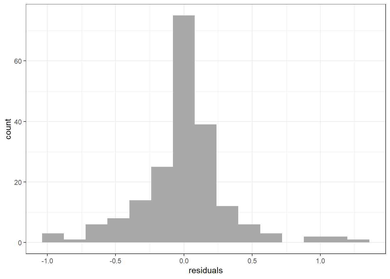
resid_qqplot = ggplot(fit_stat, aes(sample = residuals)) + stat_qq() + stat_qq_line()
print(resid_qqplot)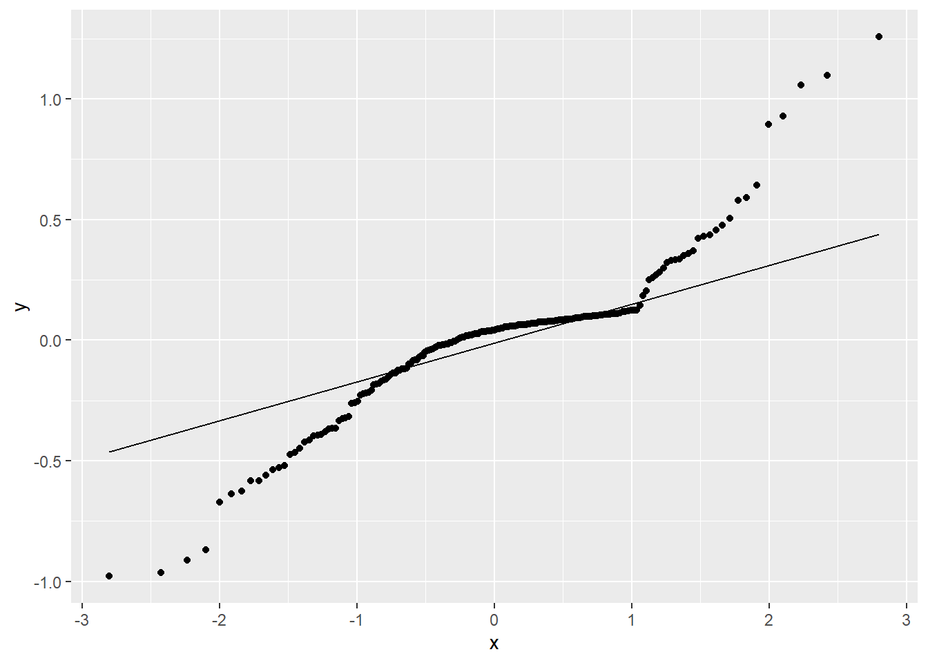
fit_v_pred = ggplot(fit_stat, aes(x = fitted_values, y = residuals)) +
  geom_point() + geom_abline(intercept = 0, slope = 0, color = "red")
print(fit_v_pred)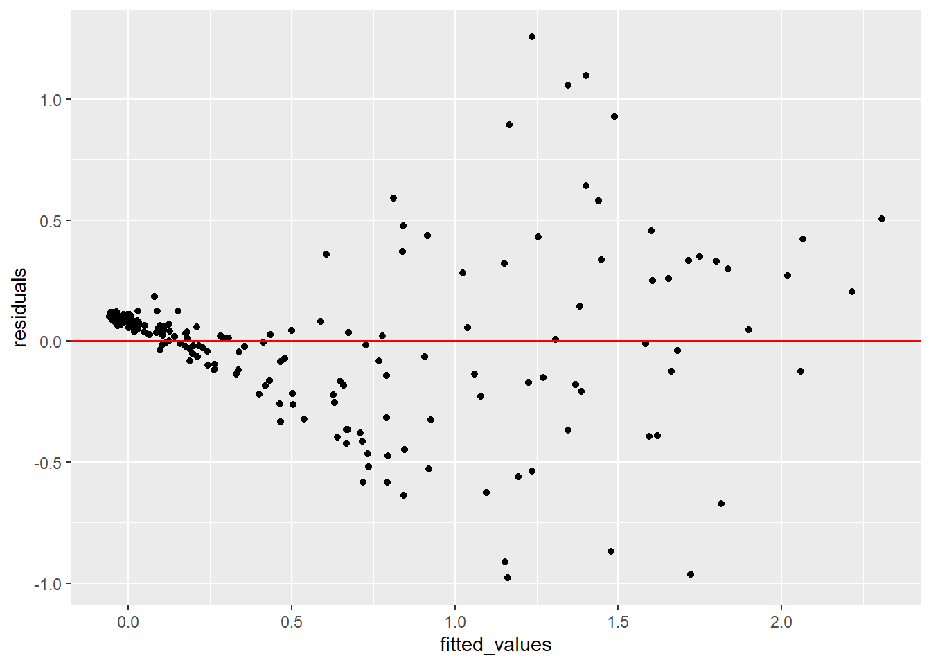
Now, lets put all the plots together in a 2x2 grid.
Attaching package: 'gridExtra'The following object is masked from 'package:dplyr':
combine`geom_smooth()` using formula = 'y ~ x'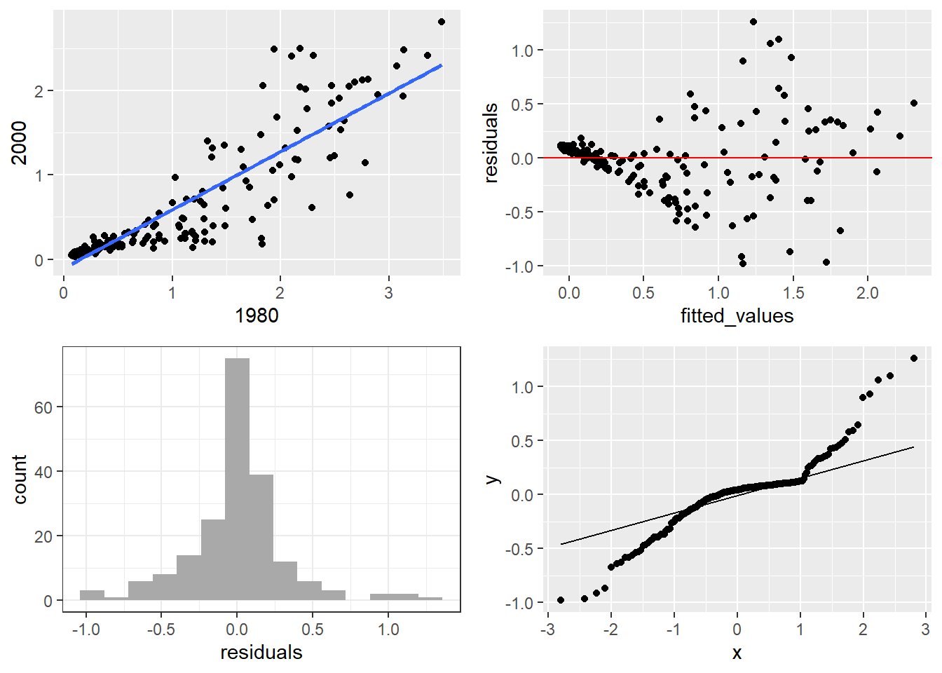
10.1.7 Saving Plots
ggplot2 provides ggsave to save plots in a number of formats, such as .png or .pdf. This function saves the last plot that you displayed.
Alternatively, you can use the base R functions such as pdf(), png(), or jpeg() to save your plot. To use these functions, you first call the save function corresponding to your desired image format, print the plot, and then call dev.off() to close the device and create the image file. Note, nothing is created until you call dev.off().
In RStudio, you can also save plots directly from the Plots window by using the Export menu (Export > Save as Image), then use the menu to select where to save, give the image file a name, and modify the width and height of the image.
10.2 Plotting with Base R (Explore on your own)
10.2.1 Basic Plots
Base Graphics parameters
Set within most plots in the base ‘graphics’ package:
- pch = point shape, http://voteview.com/symbols_pch.htm
- cex = size/scale
- xlab, ylab = labels for x and y axes
- main = plot title
- lwd = line density
- col = color
- cex.axis, cex.lab, cex.main = scaling/sizing for axes marks, axes labels, and title
The y-axis label isn’t informative, and we can change the label of the y-axis using ylab (xlab for x), and main for the main title/label.
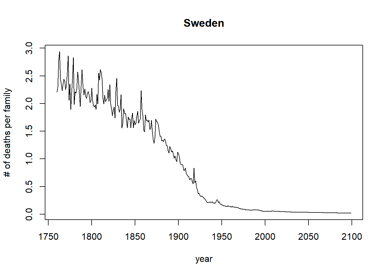
Let’s drop any of the projections and keep it to year 2012, and change the points to blue.
with(sweden_long, plot(morts ~ year,
      ylab = "# of deaths per family", main = "Sweden",
     xlim = c(1760,2012), pch = 19, cex=1.2,col="blue"))
You can also use the subset argument in the plot() function, only when using formula notation:
with(sweden_long, plot(morts ~ year,
      ylab = "# of deaths per family", main = "Sweden",
     subset = year < 2015, pch = 19, cex=1.2,col="blue"))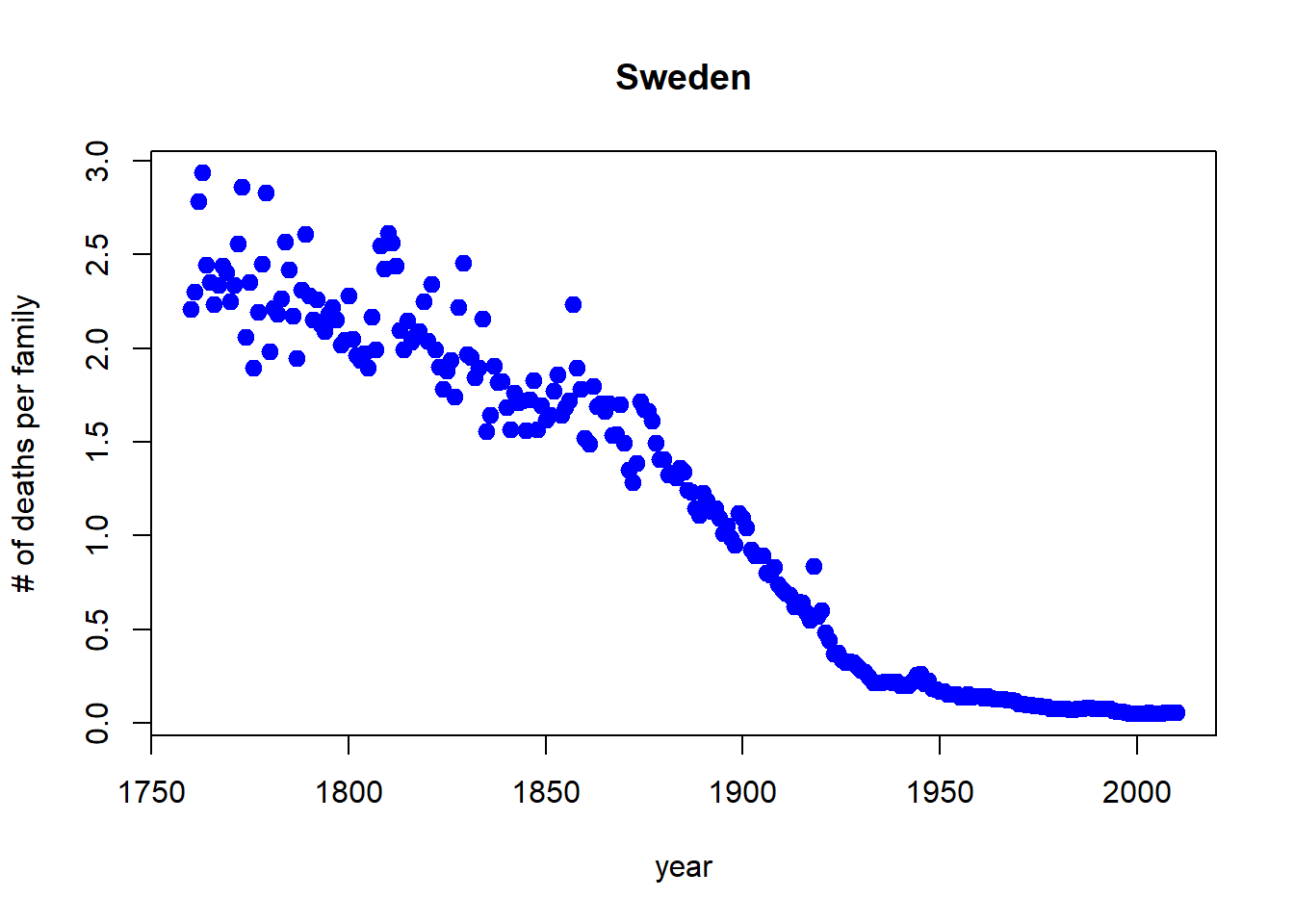
10.2.2 Bar Plots
Using the beside argument in barplot, you can get side-by-side barplots.
# Stacked Bar Plot with Colors and Legend
cars = read_csv("./data/KaggleCarAuction.csv",
                col_types = cols(VehBCost = col_double()))
counts = table(cars$IsBadBuy, cars$VehicleAge)
barplot(counts, main="Car Distribution by Age and Bad Buy Status",
  xlab="Vehicle Age", col=c("darkblue","red"),
    legend = rownames(counts), beside=TRUE)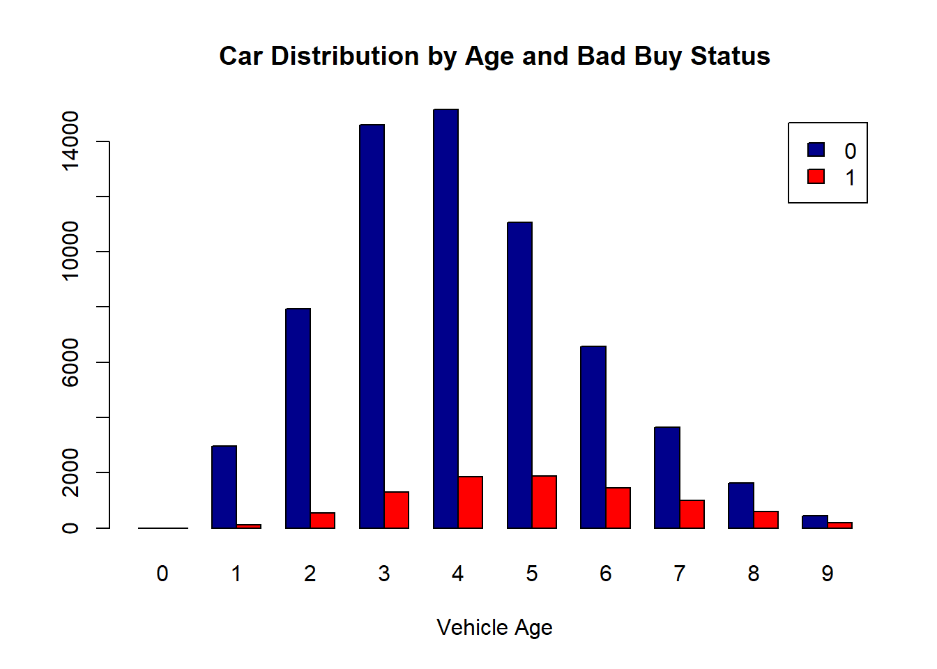
10.2.3 Boxplots, revisited
These are one of my favorite plots. They are way more informative than the barchart + antenna…
data("chickwts")
boxplot(weight ~ Diet, data=ChickWeight, outline=FALSE)
points(ChickWeight$weight ~ jitter(as.numeric(ChickWeight$Diet),0.5))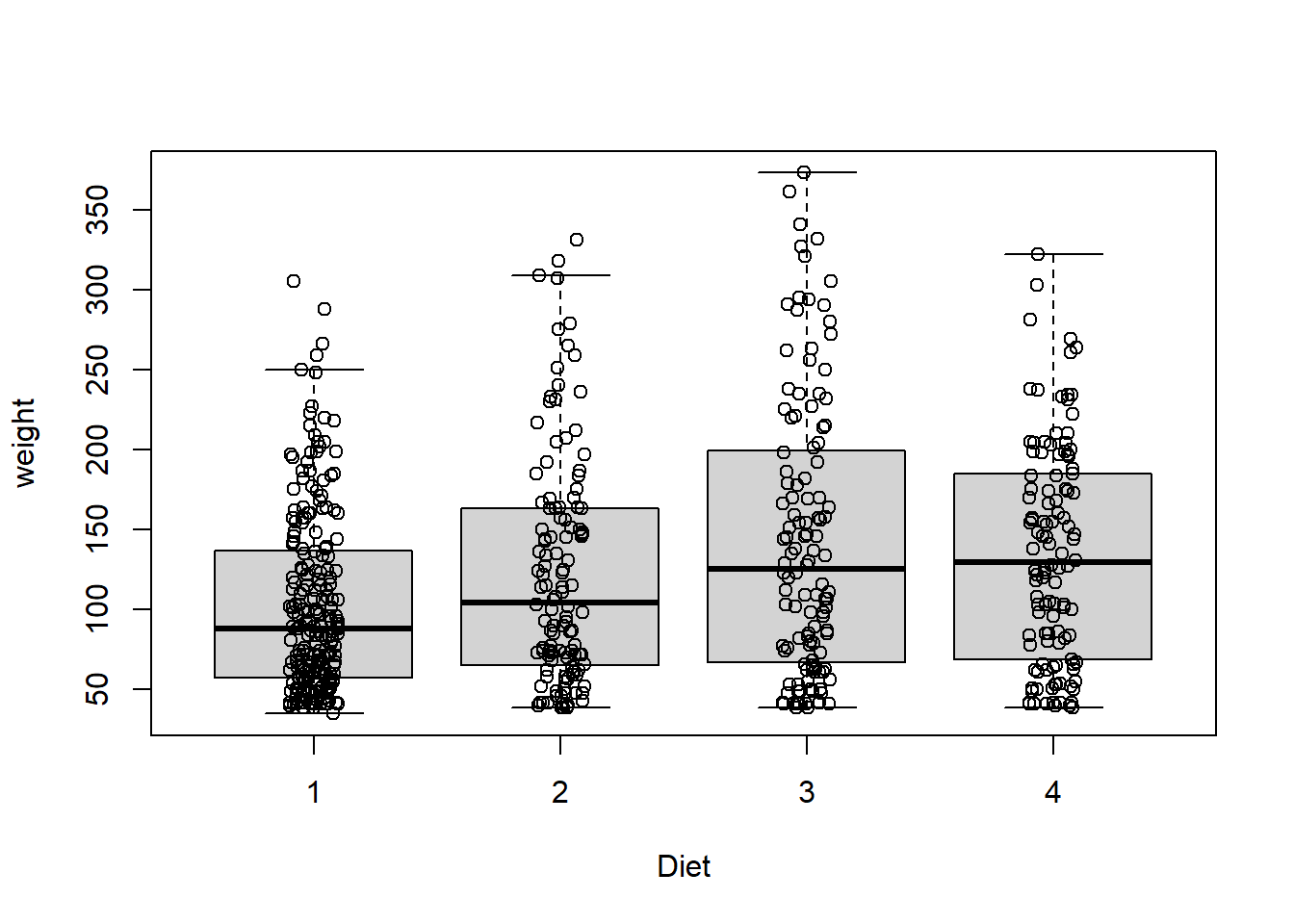
Formulas have the format of y ~ x and functions taking formulas have a data argument where you pass the data.frame. You don’t need to use $ or referencing when using formulas:
10.2.4 Colors
R relies on color ‘palettes’.
The default color palette is pretty bad, so you can try to make your own.
library(RColorBrewer)
palette(brewer.pal(5,"Dark2"))
plot(weight ~ jitter(Time,amount=0.2),data=ChickWeight,
     pch = 19,  col = Diet,xlab="Time")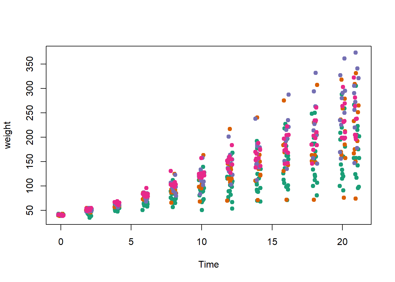
10.2.5 Adding legends
The legend() command adds a legend to your plot. There are tons of arguments to pass it.
x, y=NULL: this just means you can give (x,y) coordinates, or more commonly just give x, as a character string: “top”,“bottom”,“topleft”,“bottomleft”,“topright”,“bottomright”.
legend: unique character vector, the levels of a factor
pch, lwd: if you want points in the legend, give a pch value. if you want lines, give a lwd value.
col: give the color for each legend level
palette(brewer.pal(5,"Dark2"))
plot(weight ~ jitter(Time,amount=0.2),data=ChickWeight,
                pch = 19,  col = Diet,xlab="Time")
legend("topleft", paste("Diet",levels(ChickWeight$Diet)),
        col = 1:length(levels(ChickWeight$Diet)),
       lwd = 3, ncol = 2)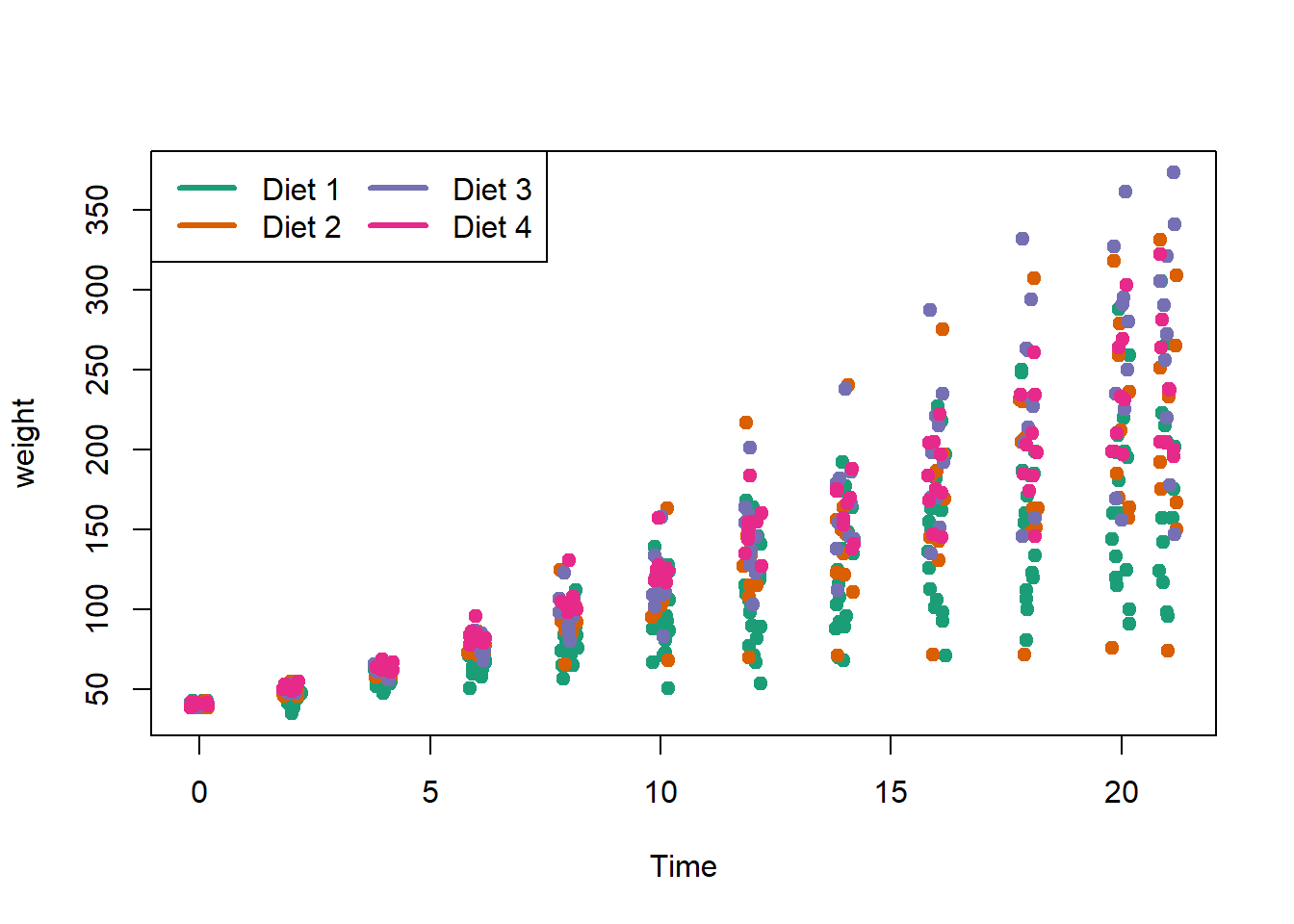
10.2.6 Coloring by variable
Rows: 1146 Columns: 15
── Column specification ──────────────────────────────────────────────
Delimiter: ","
chr  (2): day, date
dbl (13): orangeBoardings, orangeAlightings, orangeAverage, purpleBoardings,...

ℹ Use `spec()` to retrieve the full column specification for this data.
ℹ Specify the column types or set `show_col_types = FALSE` to quiet this message.palette(brewer.pal(7,"Dark2"))
dd = factor(circ$day)
plot(orangeAverage ~ greenAverage, data=circ,
pch=19, col = as.numeric(dd))
legend("bottomright", levels(dd), col=1:length(dd), pch = 19)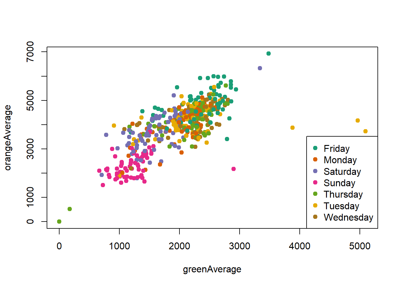
Change the orders of the levels so the days are listed in order in the legend.
dd = factor(circ$day, levels=c("Monday","Tuesday","Wednesday",
            "Thursday","Friday","Saturday","Sunday"))
plot(orangeAverage ~ greenAverage, data=circ,
     pch=19, col = as.numeric(dd))
legend("bottomright", levels(dd), col=1:length(dd), pch = 19)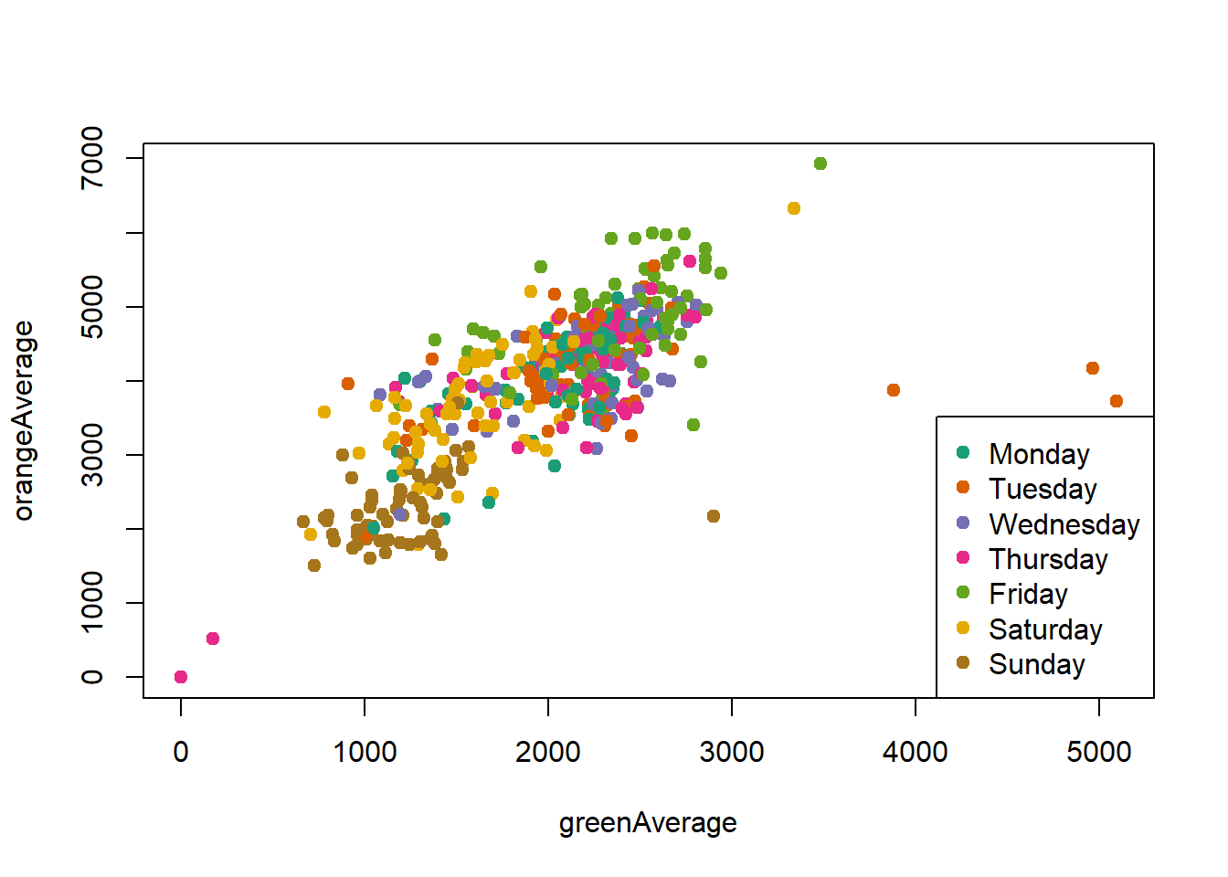
10.3 Exercises
For these exercises, we will use the charm city circulator bus ridership dataset, Charm_City_Circulator_Ridership.csv. After modifying the path to the dataset on your computer, use the following code to read in and transform the dataset to be ready for use in plotting.
library(tidyverse)
library(lubridate)
circ = read_csv("./data/Charm_City_Circulator_Ridership.csv")
# covert dates
circ = mutate(circ, date = mdy(date))
# change colnames for reshaping
colnames(circ) =  colnames(circ) %>%
  str_replace("Board", ".Board") %>%
  str_replace("Alight", ".Alight") %>%
  str_replace("Average", ".Average")

# make long
long = pivot_longer(circ, c(starts_with("orange"),
              starts_with("purple"), starts_with("green"),
              starts_with("banner")),
              names_to = "var", values_to = "number",
              )
# separate
long = separate(long, var, into = c("route", "type"),
    sep = "[.]")
## take just average ridership per day
avg = filter(long, type == "Average")
avg = filter(avg, !is.na(number))

# separate
type_wide = spread(long, type, value = number)
head(type_wide)
In these questions, try to use ggplot2 if possible.
- Plot average ridership (
avgdata set) bydateusing a scatterplot.- Color the points by route (
orange,purple,green,banner) - Add black smoothed curves for each route
- Color the points by day of the week
- Color the points by route (
- Replot 1a where the colors of the points are the name of the
route(withbanner–>blue)
- Plot average ridership by date with one panel per
route - Plot average ridership by date with separate panels by
dayof the week, colored byroute - Plot average ridership (
avg) by date, colored byroute(same as 1a). (do not take an average, use the average column for each route). Make the x-label"Year". Make the y-label"Number of People". Use the black and white themetheme_bw(). Change thetext_sizeto (text = element_text(size = 20)) intheme. - Plot average ridership on the
orangeroute versus date as a solid line, and adddashed“error” lines based on theboardingsandalightings.The line colors should beorange.(hintlinetypeis an aesthetic for lines - see alsoscale_linetypeandscale_linetype_manual. UseAlightings = "dashed", Boardings = "dashed", Average = "solid")