Chapter 13 Simulations
Simulations are a powerful statistical tool. Simulation techniques allow us to carry out statistical inference in complex models, estimate quantities that we can cannot calculate analytically or even to predict under different scenarios the outcome of some scenario such as an epidemic outbreak. In this section, we will cover the basics of simulations and simulation experiments. We will cover
- simulating a sample from common probability distributions
- simulation experiments for sampling distributions
- simulation experiments for type I error rates and power calculations.
For those interested in more complex applications of simulation, we will also provide (though not cover in class)
- simulating from non-standard distributions (Accept-Reject and MCMC)
- simulation experiment from a SIR epidemic model.
13.1 Standard Probability Distributions
Sometimes you want to generate data from a distribution (such as normal), or want to see where a value falls in a known distribution. R has these distributions built in:
- Normal
- Binomial
- Beta
- Exponential
- Gamma
- Hypergeometric
and many more in both base R and other add on packages.
Each family of functions for a distribution has 4 options:
rfor random number generation [e.g.rnorm()]dfor density [e.g.dnorm()]pfor probability [e.g.pnorm()]qfor quantile [e.g.qnorm()]
For example, we can simulate a random sample of size 5 from a standard normal distribution by using rnorm.
[1] 0.81199910 1.32466134 -0.05470965 0.38102517 -1.83418402To find the probability of being less than 5 in a Normal distribution with mean 4 and standard deviation 2, we would use pnorm.
[1] 0.3085375To find the 97.5 percentile in a standard normal distribution (i.e the number z such that 97.5% of the probability is to the left of z in a standard normal distribution), we would use qnorm.
[1] 1.95996413.2 Sampling from More Complex Distributions
There are many techniques that have been developed to sample from complex probability distributions. Some of these are used to generate samples from the r functions we saw in the previous section. A whole course can be taught on just simulation based techniques in advanced statistics. Here, I want to provide a basic introduction to two techniques: the accept-reject algorithm and the Metropolis-Hastings Markov Chain Monte Carlo Algorithm (MCMC) algorithm.
Note that the following optional sections require a course in mathematical probability, such as STA 4321 Introduction to Probability, to fully understand. Even for those without this pre-requisite knowledge, I hope the following exposition is still informative and gives you an intuitive understanding of the methods and why they are important.
13.2.1 The Accept-Reject Algorithm
The accept-reject algorithm is a method of generating a random sample from a probability distribution by first generating a proposal sample from an “envelope” distribution, which is easy to sample from, and then deciding whether or not to accept or reject this sample.
To motivate the rejection method, let us consider a simple example. say we have a continuous random variable X with pdf \(f_X\) concentrated on the interval (0,2) as shown below. We imagine “sprinkling” points \(P_1, P_2, \ldots\), uniformly at random under the density function. By sprinkling uniformly, we mean that a small target square under the pdf has the same chance of being hit wherever it is located. Our random points, \(P_t\), are actually two-dimensional random variables \((X_i, Y_i)\), where \(X_i\) and \(Y_i\) are the random coordinates of the \(i\)-th coordinate.
triangle.pdf = function(x){
  ifelse((0 < x) & (x < 1), x,
         ifelse((1 <= x) & (x < 2), 2 - x, 0))
}

triangle_plot.dat = data.frame(x = seq(-0.5, 2.5, by = 0.01),
                               y = triangle.pdf(seq(-0.5, 2.5, by = 0.01)),
                               x_sample = runif(301, 0, 2),
                               y_sample = runif(301, 0, 1))
library(ggplot2)
ggplot(triangle_plot.dat, aes(x = x, y = y)) +
  geom_line() + xlab("x") + ylab("pdf") +
  geom_segment(aes(x = 0, y = 0, xend = 0, yend = 1), linetype = "dashed") +
  geom_segment(aes(x = 0, y = 1, xend = 2, yend = 1), linetype = "dashed") +
  geom_segment(aes(x = 2, y = 1, xend = 2, yend = 0), linetype = "dashed") +
  geom_point(aes(x_sample, y_sample), shape = 1)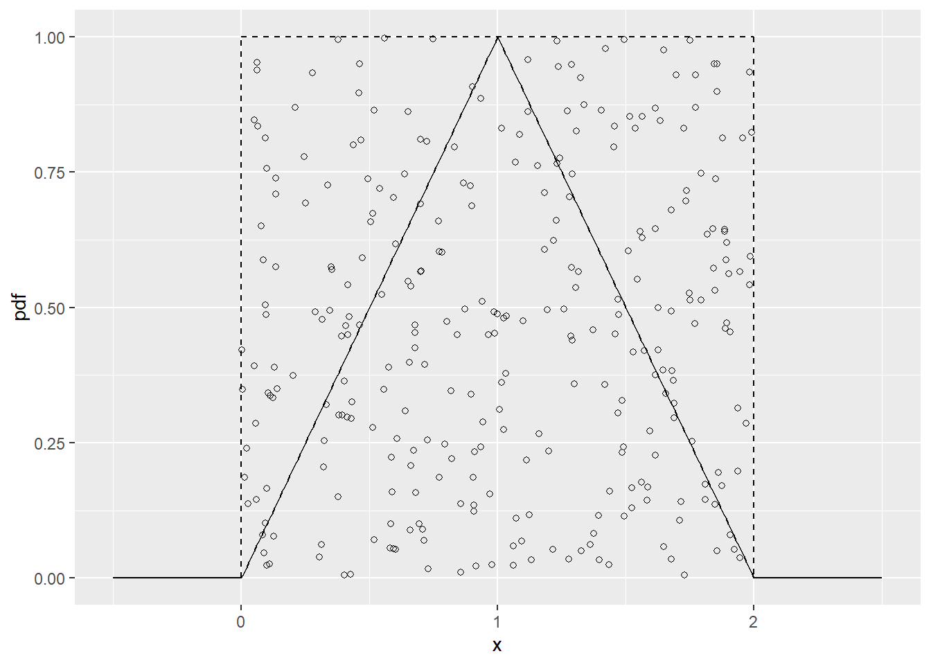
Figure 13.1: Triangular distribution with unifrom envelope functions.
How do we get these random points? First we simulate uniformly under some “envelope” region. Since we can’t simulate directly from \(f_X\), let’s consider simulating from another “envelope” distribution with density \(h\) that we can simulate from. In our example above, \(h = 0.5,\; 0<x<2,\) is the density of the uniform distribution on (0,2). If we then let \(k\) be such that \(kh \geq f_X\) and \(Y\sim U(0, kh(X))\), given \(X\), then \((X, Y)\) will be uniformly distributed over the region defined by the area below the curve \(kh\). In our example above, \(k=2\). But we only want the points under the true density, so we accept \(X\) values if \(Y<f_X(X)\) and reject them otherwise.
In this case,for the accepted X
\[\begin{align*} P(a<X<b) &= \int_{0}^\infty P(a<X<b, Y\leq y)dy \\ &= \int_{-0}^\infty \int_a^b P(Y\leq y|X=x)f_X(x)dxdy \\ &= \int_a^b\int_{-0}^{f_X(x)} P(Y\leq y|X=x)f_X(x)dydx\;\;\text{(since $Y|X,Accept\sim U(0,f_X(X))$)} \\ &= \int_a^b\int_{-0}^{f_X(x)} P(Y\leq y|X=x)f_X(x)dydx \\ &= \int_a^b f_X(x)dx \end{align*}\]
so that the accepted \(X\sim f_X\).
The accept reject algorithm is stated as follows:
To simulate from the density \(f_X\), we assume that we have an envelope density \(h\) from which we can simulate, and that we have some \(k<\infty\) such that \(\sup_x f_X(x)/h(x) <\infty\).
- Simulate X from \(h\).
- Generate \(Y\sim U(0,kh(X))\)
- If \(Y<f_X(X)\) then accept X, otherwise reject X and go back to step 1.
In our triangle distribution example, \(h(x) = 0.5\), \(0<x<2\) and 0 otherwise. Then \(f_x(x)/h(x) \leq 1/0.5 = 2\), so we take \(k=2\). To see that the algorithm works with these choices, let’s run the accept reject algorithm and plot the a histogram of the resulting sample. If it worked, then the histogram should closely mirror the true density.
accept_reject = function(fx, n = 100) {
  #simulates a sample of size n from the pdf fx using the accept reject algorithm
  x = numeric(n)
  count = 0

  while(count < n) {
    temp <- runif(1, 0, 2)
    y <- runif(1, 0, 2)
    if (y < fx(temp)) {
      count = count + 1
      x[count] <- temp
    }
  }

  return(x)
}

sample = accept_reject(triangle.pdf, 10000)
ggplot(triangle_plot.dat, aes(x = x, y = y)) +
  geom_line(color = "blue", size = 1.5) + xlab("x") + ylab("pdf") +
  geom_histogram(data = data.frame(x = sample), aes(x = x, y = ..density..), col = "gray" )
`stat_bin()` using `bins = 30`. Pick better value with `binwidth`.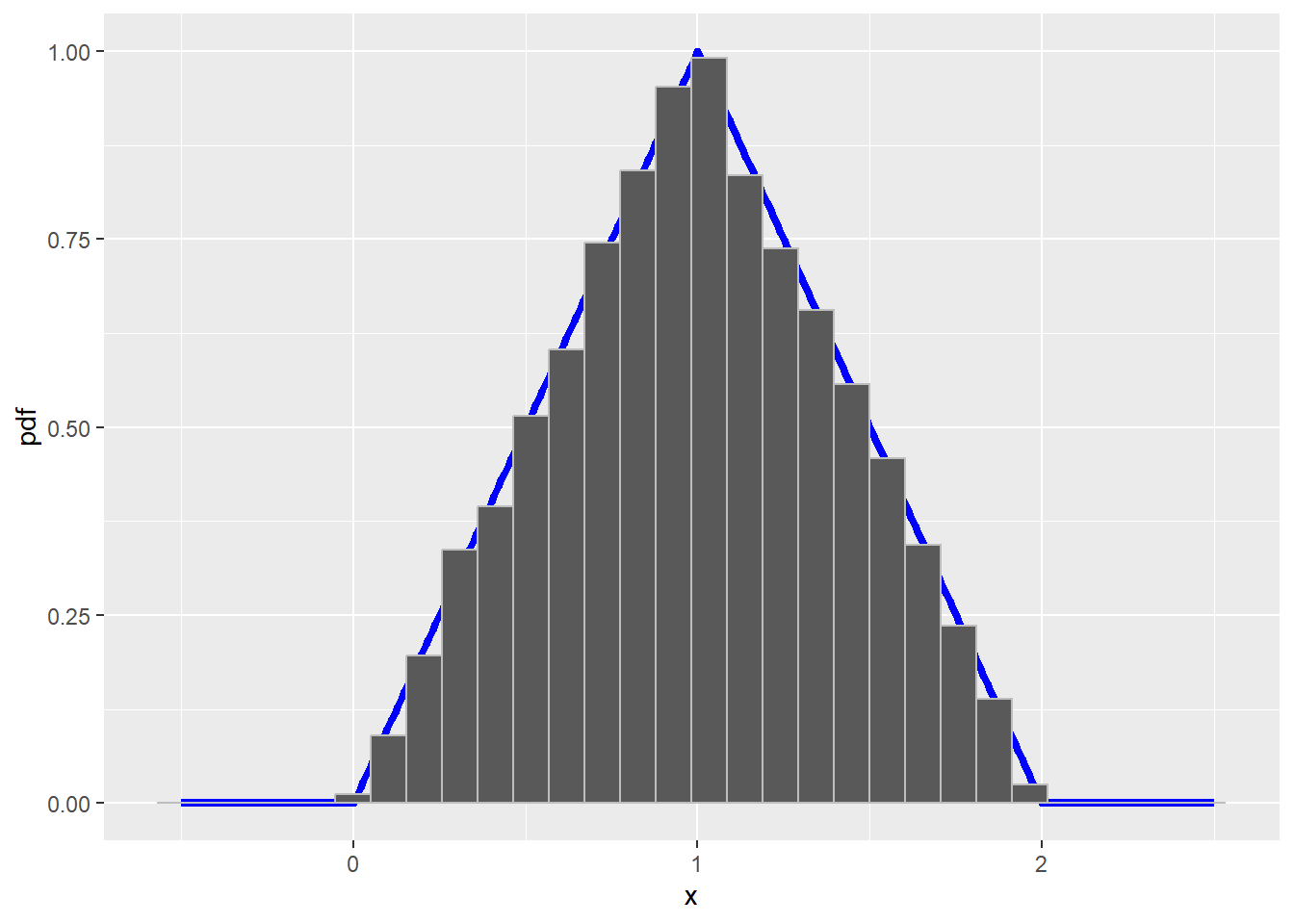
13.2.2 The Metropolis-Hastings Alogorithm
Sometimes the distribution is too complicated to find an envelope function to use the accept reject algorithm. This is very common in Bayesian models. Another option to generate a sample from a complex distribution is Markov chain Monte Carlo (MCMC). In this section we will look at an example of the Metropolis-Hastings algorithm, which is one of many MCMC algorithms.
The MCMC algorithm generates a markov chain \(X_1, X_2, \ldots\) by using a series of draws from a more common distribution, choosing at random which of these proposed draws to accept as draws from the target distribution. The probability of acceptance is calculated so that after the process has converged the accepted draws form a sample from the desired distribution.
Let’s consider the distribution with density
\[f(y) = c\exp(-y^4)(1+|y|)^3\]
where \(c\) is a normalizing constant and \(-\infty <y<\infty\). This was considered by Evans and Rosenthal (2004, Probability and Statistic).
The algorithm uses a proposal density \(q(x,y)=q(y|x)\) and decides whether or not to accept this proposal with probability \(\alpha(x,t)\). For the proposal density, we try to pick a density that is close to \(f(y)\) and easy to simulate from. We will use the normal distribution with mean equal to the previous accepted value, x, and variance 1. The acceptance probability is then
\[\begin{align*} \alpha(x,y) &= \min\left\{1, \frac{f(y)q(y,x)}{f(x)q(x,y)}\right\} \\ &= \min\left\{1, \frac{c\exp(-y^4)(1+|y|)^3 (2\pi)^{-1/2}\exp(-(y-x)^2/2)} {c\exp(-x^4)(1+|x|)^3 (2\pi)^{-1/2}\exp(-(x-y)^2/2)}\right\} \\ &= \min\left\{1, \frac{\exp(-y^4+x^4)(1+|y|)^3}{(1+|x|)^3}\right\} \end{align*}\]
To begin the process, we pick an arbitrary value for \(X_1\) to start from. Then the Metropolis-Hastings algorithm chooses \(X_{n+1}\) as follows:
- Generate \(y\) from a Normal(X_{n}, 1)$
- Compute \(\alpha(X_{n}, y)\) (formula given above)
- With probability \(\alpha(X_{n}, y)\), let \(X_{n+1}=y\) (accept new value). Otherwise, with probability \(1-\alpha(X_{n}, y)\), let \(X_{n+1}=X_{n}\) (keep the previous value).
Let’s see if this works. Let’s generate a sample using this algorithm and plot a histogram of the samples versus the true density. If the algorithm works, then the two should be very similar.
In the code below, we have a burnin period, where we discard the initial observations to allow the markov chain time to get close to stationarity (the point where iterations start to come from the desired distribution), and we thin (only keep every 10th value) to reduce the correlation between our generated data.
alphafun = function(x, y) {
  exp(-y^4 + x^4)*(1+abs(y))^3*(1+abs(x))^{-3}
}

mh_mcmc = function(alphafn, burnin, N, thin) {
  x = numeric(burnin + N*thin)
  x[1] = rnorm(1)
  for (i in 2:(burnin + N*thin)) {
    propy = rnorm(1, x[i - 1], 1)
    alpha = min(1, alphafn(x[i-1], propy))
    x[i] = ifelse(rbinom(1, 1, alpha), propy, x[i-1])
  }
  return(x[burnin + (1:N)*thin])
}

sample = mh_mcmc(alphafun, 5000, 10000, 10)

f_true = function(x) {
  exp(-x^4)*(1+abs(x))^3
}

integral = integrate(f_true, 0, Inf)
c = 2 * integral$value

f_true = function(x) {
  exp(-x^4)*(1+abs(x))^3 / c
}

f_true_plot.dat = data.frame(x = seq(-2, 2, length = 100),
                             y = f_true(seq(-2, 2, length = 100)))

ggplot(f_true_plot.dat, aes(x, y)) +
  geom_line(color = "blue", size = 1.2) + ylab("pdf") +
  geom_histogram(data = data.frame(x = sample), aes(x = x, y = ..density..),
                 color = "gray")
`stat_bin()` using `bins = 30`. Pick better value with `binwidth`.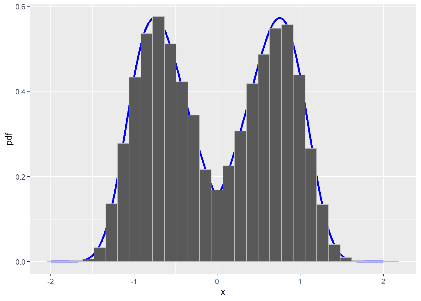
Figure 13.2: True density with histogram of sample from a Metropolis-Hastings MCMC algorithm
13.3 Simulation Studies/Experiments
What is a simulation study?
- A numerical technique for conducting experiments on a computer
- It involves randomly sampling from probability distributions
Why conduct a simulation study?
- To validate a statistical method so people can use it with confidence
- Examine analytic properties that are rarely possible to calculate exactly
- Check how large N properties behave in (finite) samples
- Check how a statistical technique performs when the assumptions are not met
Common Questions A Simulation Study Can Answer
- Is an estimator unbiased?
- Does a proposed confidence interval achieve the stated coverage (e.g. 95%)?
- Does a hypothesis test attain the stated significance level (Type I Error Probability)?
- What is the power of a given hypothesis test?
Now we want to apply simulation techniques to help answer different research problems. We will look at two example simulation studies. The second one is a more complicated example of a simulation related to the SIR epidemic model. You need not understand all the details of this examples, but I provide them as a more complex example for the interested student.
- Simulating the type I error rate of the student’s one sample t-test
- Simulating an disease outbreak using a SIR model (more advanced, not covered in class)
13.3.1 Simulation Study of Student’s T-test
The following example is borrowed from Using R and RStudio for Data Management, Statistical Analysis, and Graphics by N. Horton and K. Kleinmen.
A common rule of thumb is that the sampling distribution of the mean is approximately normal for samples of size 30 or larger. Tim Hesterberg has argued that the \(n\geq 30\) rule may need to be retired. He demonstrates that for sample sizes much larger than typically though necessary, the one-sided error rate of the t-test is not appropriately preserved. We explore this by generating a sample of size \(n=30,50,100\) from a heavily right skewed distribution, the exponential distribution with mean 1, and carrying out a one sample t-test which assumes the null value for the mean is 1 (i.e. the null hypothesis is true for our data). We’ll repeat this 1000 times, and examine the proportion of times that the t-test rejects the null hypothesis. If the test is working properly and we use the 0.05 significance level, then about 5% of these tests should reject the null hypothesis by chance.
set.seed(5) #Make the results reproducible. Setting the seed allows others
            #to run your code and get the same outcome from the simulation.

t.test.sim = function(n = 30, N = 1000){

  reject = logical(N) #Did this sample lead to a rejection of H0?

  for (i in 1:N) {
    x = rexp(n, rate = 1) #generate a sample of size n from Exp(1) distribution
    t.test.p.value = t.test(x, mu = 1, alternative = "less")$p.value
    reject[i] = (t.test.p.value < 0.05) #Do we reject H0?
  }

  mean(reject) #estimated type 1 error rate
}

t.test.sim()
[1] 0.086[1] 0.073[1] 0.081[1] 0.054Notice that in this case, the type I error is inflated to around 8.6% rather than the desired 5% when \(n=30\). It is not until we have a sample size of around 500 that the type I error rate is close to the desired 5%. It seems that when the data are from a population that is heavily right skewed, the one-sided (lower than alternative) t-test does not work as expected for smaller samples.
13.3.2 Simulating an Epidemic from a SIR Model
The following example is borrowed from Introduction to Scientific Programming and Simulation Using R by O. Jones, R. Maillardet, and A. Robinson.
The science of epidemiology, the study of the spread of disease, includes mathematical/statistical models of how disease spreads. In the SIR model, which stands for Susceptible, Infected, and Removed, we suppose that individuals can be one of three types: susceptible if they have not yet caught the disease, infected if they currently have the disease, or removed if they have had the disease and since recovered (and are now immune) or died. In the following descriptions, we will use the type labels - susceptible, infected, and removed - as shorthand to describe individuals of that type. We will measure time in discrete time steps. At each time step, each infected can infect susceptibles or can recover/die, at which point the infected is removed.
Let \(S(t)\), \(I(t)\), and \(R(t)\) be the number of susceptible, infected and removed individuals at time \(t\). At each time step, each infected has probability \(\alpha\) of infecting each susceptible. (This assumes that each infected has equal contact with all susceptibles. This is called a mixing assumption.) At the end of each time step, after having had a chance to infect people, each infected has probability \(\beta\) of being removed.
We take initial conditions
\[\begin{align*} S(0) &= N\\ I(0) &= 1 \\ R(0) & = 0. \end{align*}\]
Note that the total population size is \(N+1\) and this remains fixed. That is \(S(t) + I(t)+R(t)=N+1\) for all \(t\).
At each time step \(t\), the chance that a susceptible remains uninfected is \((1-\alpha)^{I(t)}\). That is, each infected must fail to pass on the infection to the susceptible. Thus,
\[S(t+1)\sim\text{Binomial}(S(t), (1-\alpha)^{I(t)}).\] As each infected has a chance \(\beta\) of being removed, we have
\[R(t+1)\sim R(t)+\text{Binomial}(I(t), \beta).\] Given \(S(t+1)\) and \(R(t+1)\), we get \(I(t+1)\) from the total population \[I(t+1)=N+1-R(t+1)-S(t+1).\] These rules are enough to write a simulation of a SIR process.
SIRsim <- function(a, b, N, T) {
  # Simulate an SIR epidemic
  # a is infection rate, b is removal rate
  # N initial susceptibles, 1 initial infected, simulation length T
  # returns a matrix size (T+1)*3 with columns S, I, R respectively
  S <- rep(0, T+1)
  I <- rep(0, T+1)
  R <- rep(0, T+1)
  S[1] <- N
  I[1] <- 1
  R[1] <- 0
  for (i in 1:T) {
    S[i+1] <- rbinom(1, S[i], (1 - a)^I[i])
    R[i+1] <- R[i] + rbinom(1, I[i], b)
    I[i+1] <- N + 1 - R[i+1] - S[i+1]
  }
  return(data.frame(S=S, I=I, R=R))
}
In Figure 13.3, we plot \(S(t)\), \(I(t)\), and \(R(t)\) for four separate simulations, with \(\alpha = 0.0005\) and \(\beta=0.1,0.2,0.3,0.4\). We see that as \(\beta\) increases, the size of the epidemic decreases.
set.seed(500)

sim1 = SIRsim(0.0005, 0.1, 1000, 100)
sim2 = SIRsim(0.0005, 0.2, 1000, 100)
sim3 = SIRsim(0.0005, 0.3, 1000, 100)
sim4 = SIRsim(0.0005, 0.4, 1000, 100)
sim_data = as.data.frame(rbind(sim1, sim2, sim3, sim4))
sim_data$sim_num = rep(c(1,2,3,4), each = 101)
sim_data$time = rep(1:101, times = 4)

library(gridExtra)
library(ggpubr)
Attaching package: 'ggpubr'The following objects are masked from 'package:tidylog':
group_by, mutatelibrary(dplyr)
sim_data = as_tibble(sim_data)
S1 <- sim_data %>% filter(sim_num == 1) %>%
ggplot(aes(x = time, y = S)) +
geom_line() + xlab("") + ylab("S(t)") +
ylim(c(0,1000))filter: removed 303 rows (75%), 101 rows remainingI1 <- sim_data %>% filter(sim_num == 1) %>%
ggplot(aes(x = time, y = I)) +
geom_line() + xlab("") + ylab("I(t)") +
ylim(c(0,1000))filter: removed 303 rows (75%), 101 rows remainingR1 <- sim_data %>% filter(sim_num == 1) %>%
ggplot(aes(x = time, y = R)) +
geom_line() + xlab("") + ylab("R(t)") +
ylim(c(0,1000))filter: removed 303 rows (75%), 101 rows remainingSIR1 <- ggarrange(S1, I1, R1, ncol = 1)
SIR1 <- annotate_figure(SIR1, top = "alpha = 0.0005 beta = 0.1")
S2 <- sim_data %>% filter(sim_num == 2) %>%
ggplot(aes(x = time, y = S)) +
geom_line() + xlab("") + ylab("S(t)") +
ylim(c(0,1000))filter: removed 303 rows (75%), 101 rows remainingI2 <- sim_data %>% filter(sim_num == 2) %>%
ggplot(aes(x = time, y = I)) +
geom_line() + xlab("") + ylab("I(t)") +
ylim(c(0,1000))filter: removed 303 rows (75%), 101 rows remainingR2 <- sim_data %>% filter(sim_num == 2) %>%
ggplot(aes(x = time, y = R)) +
geom_line() + xlab("") + ylab("R(t)") +
ylim(c(0,1000))filter: removed 303 rows (75%), 101 rows remainingSIR2 <- ggarrange(S2, I2, R2, ncol = 1)
SIR2 <- annotate_figure(SIR2, top = "alpha = 0.0005 beta = 0.2")
S3 <- sim_data %>% filter(sim_num == 3) %>%
ggplot(aes(x = time, y = S)) +
geom_line() + xlab("") + ylab("S(t)") +
ylim(c(0,1000))filter: removed 303 rows (75%), 101 rows remainingI3 <- sim_data %>% filter(sim_num == 3) %>%
ggplot(aes(x = time, y = I)) +
geom_line() + xlab("") + ylab("I(t)") +
ylim(c(0,1000))filter: removed 303 rows (75%), 101 rows remainingR3 <- sim_data %>% filter(sim_num == 3) %>%
ggplot(aes(x = time, y = R)) +
geom_line() + xlab("") + ylab("R(t)") +
ylim(c(0,1000))filter: removed 303 rows (75%), 101 rows remainingSIR3 <- ggarrange(S3, I3, R3, ncol = 1)
SIR3 <- annotate_figure(SIR3, top = "alpha = 0.0005 beta = 0.3")
S4 <- sim_data %>% filter(sim_num == 4) %>%
ggplot(aes(x = time, y = S)) +
geom_line() + xlab("") + ylab("S(t)") +
ylim(c(0,1000))filter: removed 303 rows (75%), 101 rows remainingI4 <- sim_data %>% filter(sim_num == 4) %>%
ggplot(aes(x = time, y = I)) +
geom_line() + xlab("") + ylab("I(t)") +
ylim(c(0,1000))filter: removed 303 rows (75%), 101 rows remainingR4 <- sim_data %>% filter(sim_num == 4) %>%
ggplot(aes(x = time, y = R)) +
geom_line() + xlab("") + ylab("R(t)") +
ylim(c(0,1000))filter: removed 303 rows (75%), 101 rows remainingSIR4 <- ggarrange(S4, I4, R4, ncol = 1)
SIR4 <- annotate_figure(SIR4, top = "alpha = 0.0005 beta = 0.4")
ggarrange(SIR1, SIR2, SIR3, SIR4, ncol = 2, nrow = 2)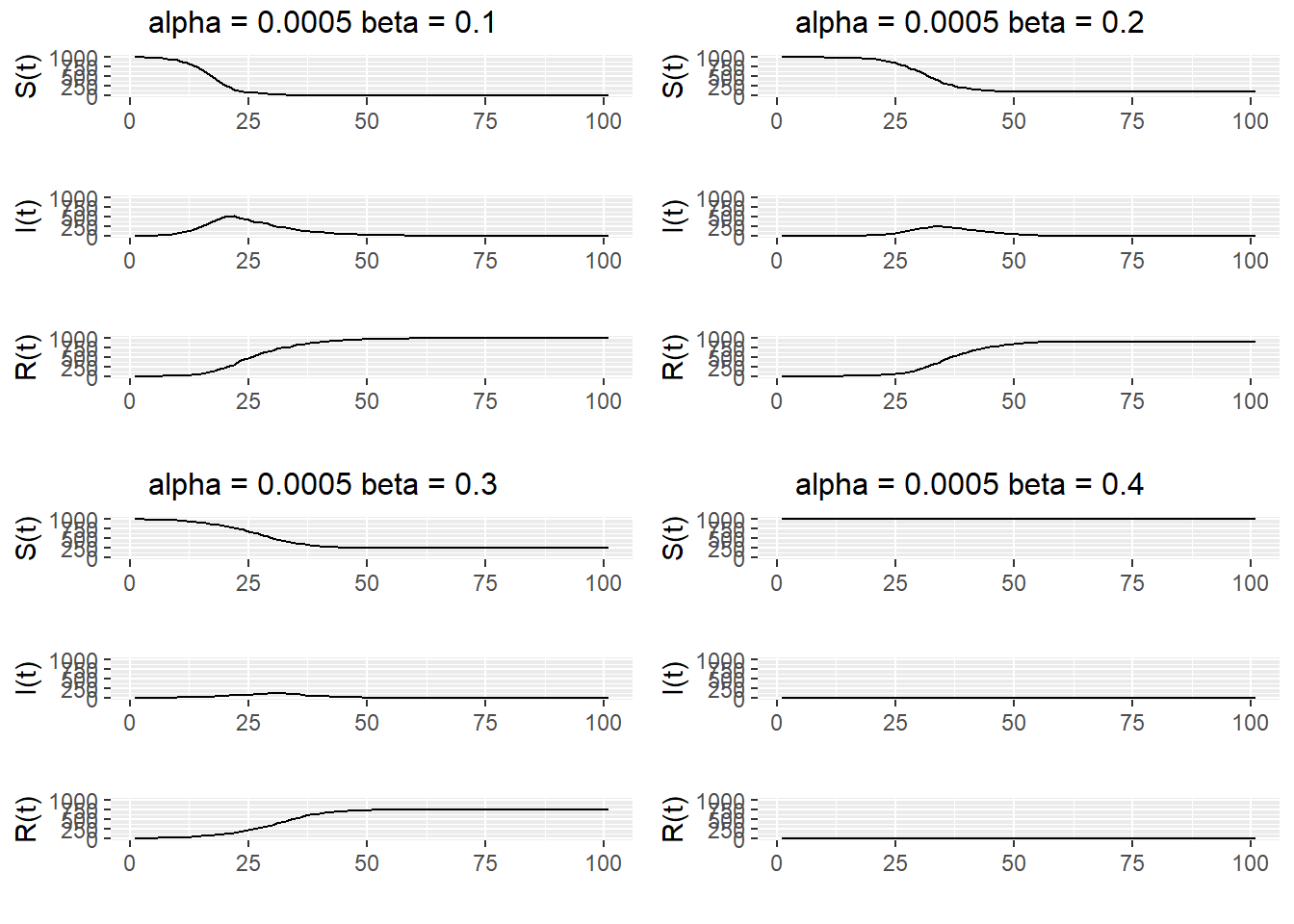
Figure 13.3: Simulations of a SIR epidemic with \(\alpha\) = 0.0005$ and \(\beta = 0.1, 0.2, 0.3, 0.4\).
To see the range of behavior possible for a single \(\alpha\) and \(\beta\), we plot several realizations of the simulation on the same graph (see Figure 13.4). We see that the epidemic either die out quickly or else grow to be quite large when \(\alpha = 0.0005\) and \(\beta=0.3\).
SIRsim_data <- data.frame(S = 0, I = 0, R = 0, time = 0, sim_num = 0)
for (i in 1:20) {
  SIRsim_data = rbind(SIRsim_data, cbind(SIRsim(0.0005, 0.3, 1000, 100), time = 1:101, sim_num = rep(i, 101)))
}

S_plot = ggplot(SIRsim_data, aes(x = time, y = S, group = sim_num)) +
  geom_line(color = "black") +
  xlab("") + ylab("S(t)") + ylim(c(0,1000))
I_plot = ggplot(SIRsim_data, aes(x = time, y = I, group = sim_num)) +
  geom_line(color = "black") +
  xlab("") + ylab("I(t)") + ylim(c(0,1000))
R_plot = ggplot(SIRsim_data, aes(x = time, y = R, group = sim_num)) +
  geom_line(color = "black") +
  xlab("") + ylab("R(t)") + ylim(c(0,1000))
ggarrange(S_plot, I_plot, R_plot, ncol = 1) %>%
  annotate_figure(top = "alpha = 0.0005 beta = 0.3")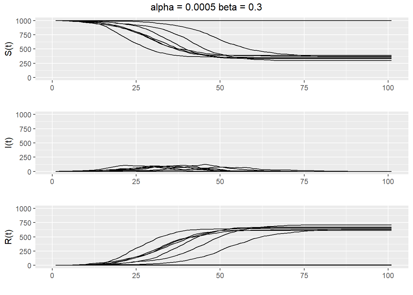
Figure 13.4: Twenty realizations of a SIR epidemic with \(\alpha = 0.0005\) and \(\beta=0.3\).
It would also be nice to know exactly how \(\alpha\) and \(\beta\) affect the size of the epidemic. Using simulation, we can estimate \(E[S(T)]\), the expected number of susceptibles remaining at time T, for different values of \(\alpha\) and \(\beta\). The following code does this for \(\alpha \in [0.0001, 0.001]\) and \(\beta\in [0.1,0.5]\) and plots the results on a 3D graph.
# discrete SIR epidemic model
#
# initial susceptible population N
# initial infected population 1
# infection probability a
# removal probability b
#
# estimates expected final population size for different values of
# the infection probability a and removal probability b
# we observe a change in behaviour about the line Na = b
# (Na is the expected number of new infected at time 1 and
# b is the expected number of infected who are removed at time 1)

SIR <- function(a, b, N, T) {
  # simulates SIR epidemic model from time 0 to T
  # returns number of susceptibles, infected and removed at time T
  S <- N
  I <- 1
  R <- 0
  for (i in 1:T) {
    S <- rbinom(1, S, (1 - a)^I)
    R <- R + rbinom(1, I, b)
    I <- N + 1 - S - R
  }
  return(c(S, I, R))
}

# set parameter values
N <- 1000
T <- 100
a <- seq(0.0001, 0.001, by = 0.0001)
b <- seq(0.1, 0.5, by = 0.05)
num_points = length(a)*length(b)

n.reps <- 400 # sample size for estimating E S[T]
f.name <- "./data/SIR_grid.dat" # file to save simulation results

# estimate E S[T] for each combination of a and b
write(c("a", "b", "S_T"), file = f.name, ncolumns = 3)
for (i in 1:length(a)) {
  for (j in 1:length(b)) {
    S.sum <- 0
    for (k in 1:n.reps) {
      S.sum <- S.sum + SIR(a[i], b[j], N, T)[1]
    }
    write(c(a[i], b[j], S.sum/n.reps), file = f.name,
      ncolumns = 3, append = TRUE)
  }
}
# plot estimates in 3D
g <- read.table(f.name, header = TRUE)
library(lattice)
print(wireframe(S_T ~ a*b, data = g, scales = list(arrows = FALSE),
aspect = c(.5, 1), drape = TRUE,
xlab = "a", ylab = "b", zlab = "E S[T]"))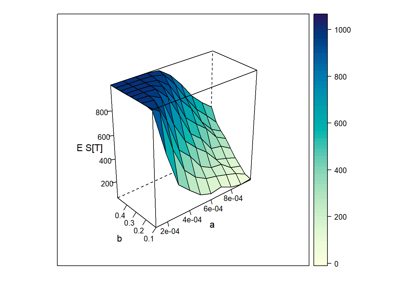
Figure 13.5: Epected number of susceptibles remainig at time T for various \(\alpha\) and \(\beta\).
13.4 Exercises
- Simulate a random sample of size \(n=100\) from
- a normal distribution with mean 0 and variance 1. (see
rnorm) - a normal distribution with mean 1 and variance 1. (see
rnorm) - a uniform distribution over the interval [-2, 2]. (see
runif)
- a normal distribution with mean 0 and variance 1. (see
- Run a simulation experiment to see how the type I error rate behaves for a two sided one sample t-test when the true population follows a Uniform distribution over [-10,10]. Modify the function
t.test.simthat we wrote to run this simulation by- changing our random samples of size
nto come from a uniform distribution over [-10,10] (seerunif). - performing a two sided t-test instead of a one sided t-test.
- performing the test at the 0.01 significance level.
- choosing an appropriate value for the null value in the t-test. Note that the true mean in this case is 0 for a Uniform(-10,10) population.
Try this experiment for
n=10,30,50,100,500. What happens the estimated type I error rate asnchanges? Is the type I error rate maintained for any of these sample sizes?
- changing our random samples of size
- From introductory statistics, we know that the sampling distribution of a sample mean will be approximately normal with mean \(\mu\) and standard error \(\sigma/\sqrt{n}\) if we have a random sample from a population with mean \(\mu\) and standard deviation \(\sigma\) and the sample size is “large” (usually at least 30). In this problem, we will build a simulation that will show when the sample size is large enough.
- Generate
N=500samples of sizen=50from a Uniform[-5,5] distribution. - For each of the
N=500samples, calculate the sample mean, so that you now have a vector of 500 sample means. - Plot a histogram of these 500 sample means. Does it look normally distributed and centered at 0?
- Turn this simulation into a function that takes arguments
Nthe number of simulated samples to make andnthe sample size of each simulated sample. Run this function forn=10,15,30,50. What do you notice about the histogram of the sample means (the sampling distribution of the sample mean) as the sample size increases.
- Generate